The Anatomy of Great UX: 4 Examples to Learn From
What is great UX? I love this question because everyone almost always has a different definition of “great” (and everyone has their own definition of User Experience). So to clear things up, here’s mine (definitely stolen from someone else because good designers steal, right?): Good UX is fiercely user centric. It’s about optimising usability, accessibility, and user satisfaction through meticulous research and iterative design. At its core, it focuses on understanding and anticipating user needs, desires, and pain points. But great UX goes beyond just giving users what they ask for; it’s about finding that sweet spot where user needs, business goals, and technological possibilities converge. In a digital landscape where first impressions can make or break a product, great UX isn’t just a nice-to-have – it’s a crucial driver of user satisfaction, brand loyalty, and business success.
So, what does great UX look like? Luckily, there are 4 examples that break the great points of their UX. Whether it’s simplifying payroll like Gusto, demystifying taxes like TurboTax, streamlining government services like the CA DMV, or enhancing quoting processes like Seven Seas Worldwide, great UX always puts the user first.
Let’s take a look, shall we?
Seven Seas Worldwide: Transparent Pricing and Clear Information Hierarchy
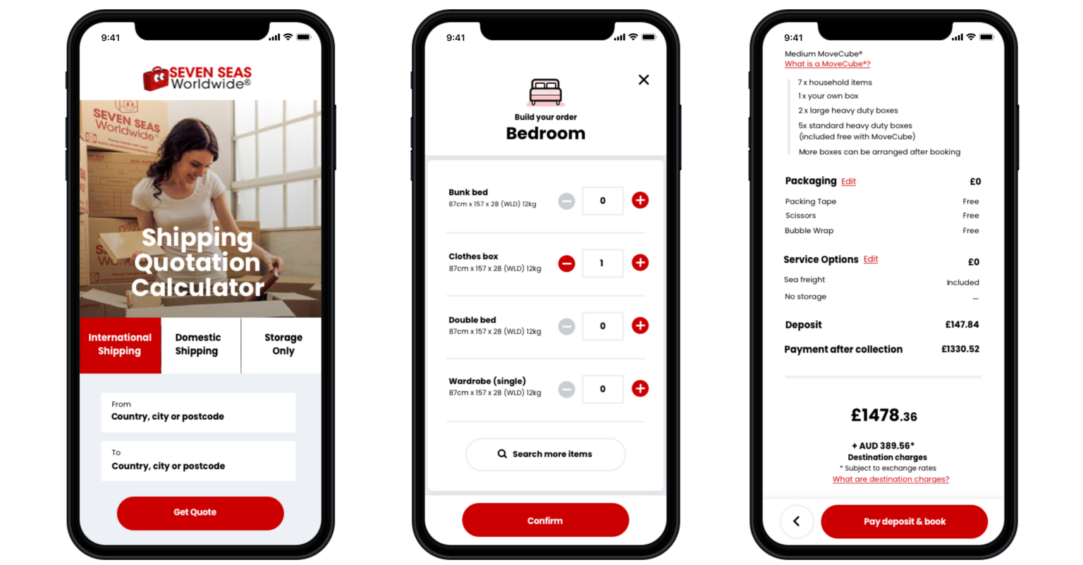
Seven Seas Worldwide demonstrates how focusing on transparency and clear information presentation can significantly improve UX, particularly in complex or technical industries. Their redesigned quoting engine offers valuable lessons in great UX design examples.
Key aspects of Seven Seas Worldwide’s great UX:
Transparent pricing: Unlike industry norms, Seven Seas decided to include taxes in their quoted prices. This transparency built trust with users, especially those encountering the brand for the first time.
Clear information hierarchy: The redesign process involved carefully considering how information was presented. This included tackling issues like organising long drop-down lists and categorising items logically.
User-centric design process: Their partnership Browser London utilised a Design Sprint 2.0 workshop followed by extensive user testing. This approach allowed them to rapidly prototype and iterate based on user feedback.
Explanation tooltips: In response to user feedback, tooltips and illustrations were added throughout the quoting journey. These helped users understand specialist terminology, further building trust and ease of use.
Gusto: Focused Simplicity
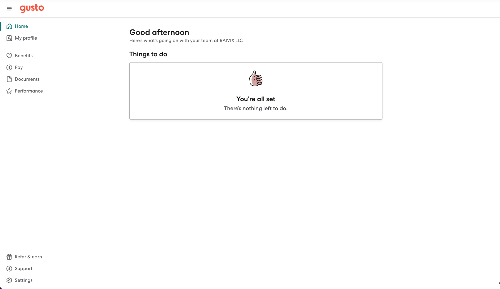
Gusto, formerly known as ZenPayroll, is a prime example of how focusing on a single, core feature can lead to great UX. Their approach offers insights into great learning UX design principles.
Key aspects of Gusto’s great UX:
Single-feature focus: Initially, Gusto focused solely on payroll, perfecting this one aspect before expanding to other HR functions.
Solving a real pain point: They addressed a significant issue in the market, where running payroll was a complex, manual process.
Simplicity: By moving the entire process online, they eliminated the need for phone calls and paperwork.
User-centric design: They designed the product around the user’s needs, making it easy to set up and run payroll without extensive training.
TurboTax: Mastering UX Writing
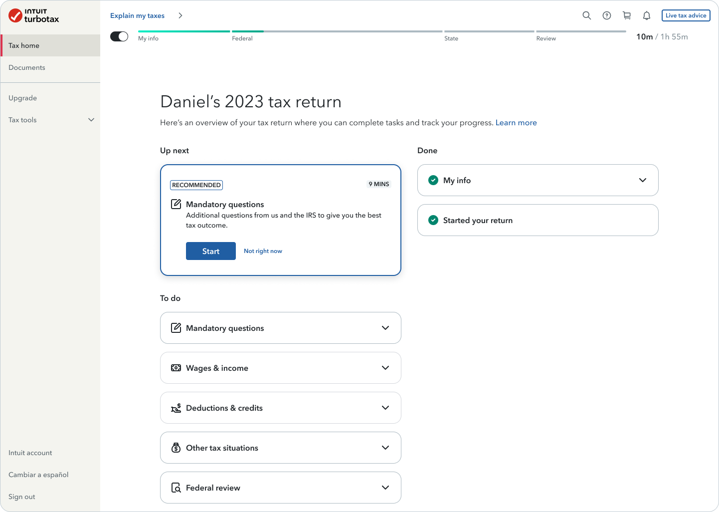
TurboTax, developed by Intuit, has transformed the daunting task of filing taxes into a more manageable and even somewhat pleasant experience. Their success lies heavily in their masterful use of UX writing, providing an excellent case study for great UX research portfolios.
Key aspects of TurboTax’s great UX:
Conversational tone: TurboTax uses friendly, conversational language that makes users feel like they’re talking to a knowledgeable friend rather than navigating complex tax jargon.
Step-by-step guidance: The platform breaks down the tax filing process into manageable steps, reducing overwhelm and anxiety.
Personalization: TurboTax personalised the experience by asking relevant questions and tailoring the process to each user’s specific situation.
Clear value proposition: They emphasise the benefit to users with messaging like “maximum refund, guaranteed,” focusing on what matters most to their audience.
Progress indicators: TurboTax provides clear indicators of progress throughout the filing process, helping users understand where they are and what’s left to do.
Note: While TurboTax exemplifies great UX design, it’s important to note that a well-designed product doesn’t equate to good business practices. Intuit, TurboTax’s parent company, has faced significant scrutiny and legal challenges regarding its marketing and lobbying practices. It is always possible to highlight the value of good design practices if one also pairs that with a healthy, and justified, criticism of the company/organisation.
CA DMV: Surprising Excellence in Government UX
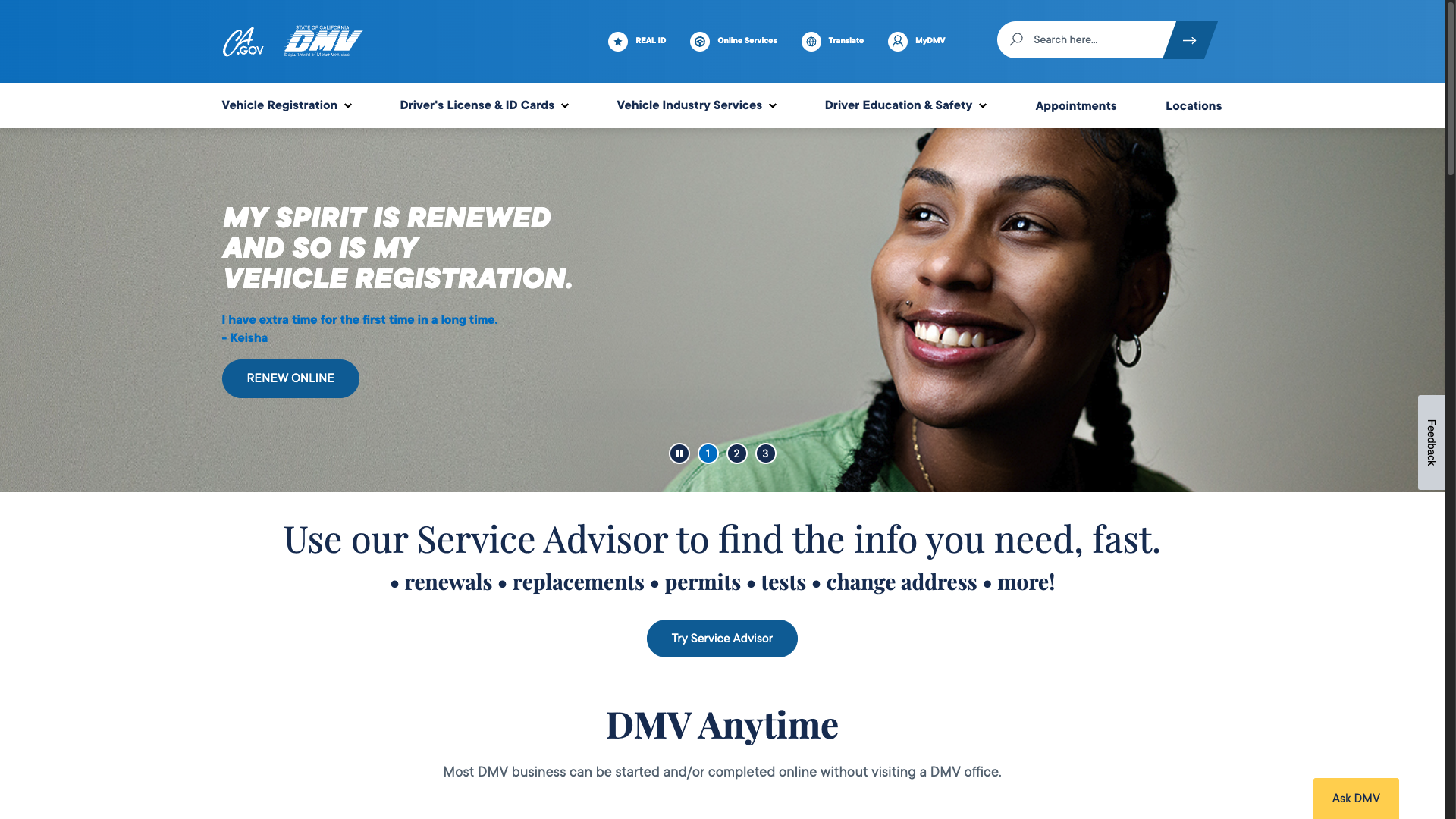
The California Department of Motor Vehicles (DMV) website, DMV.CA.GOV, stands out as an unexpected example of great UX in the government sector. It serves as an inspiring case for great UX design examples in traditionally challenging contexts.
Key aspects of CA DMV’s great UX:
Task-oriented design: The main navigation is organised around top user tasks, making it easy for visitors to find what they need quickly.
Conversational tone: The site uses personal pronouns like “you” and “my,” creating a more engaging and friendly user experience.
Clear instructions: Helpful checklists and step-by-step guides assist users in completing various DMV-related tasks.
Accessible design: The website is designed with accessibility in mind, ensuring it’s usable by people with various abilities.
Conclusion: Elevating Your Digital Product with Great UX
As we’ve seen from these examples – Gusto, TurboTax, CA DMV, and Seven Seas Worldwide – great UX is not just about flashy designs or cutting-edge technology. It’s about understanding your users, simplifying complex processes, and creating transparent, trustworthy experiences. These successful products share common threads: they prioritise user needs, use clear communication, and continuously iterate based on feedback.
But where do you start? The journey to great UX begins with solid research and a relentless focus on user experience. It’s about working people-first, not technology-first, and solving complex problems with simple, low-waste solutions.
At Browser London, we specialise in helping organisations like yours navigate this journey. Our approach combines careful research, user-centric design, and continuous iteration to create digital products that add business value and make customers happy. From user research and analysis to prototyping and development, we’re here to help you at every step of the way.
Thanks to Tran Mau Tri Tam for the photo ❤️