The rise of dark mode in UI design

Dark mode or light mode, which are you?
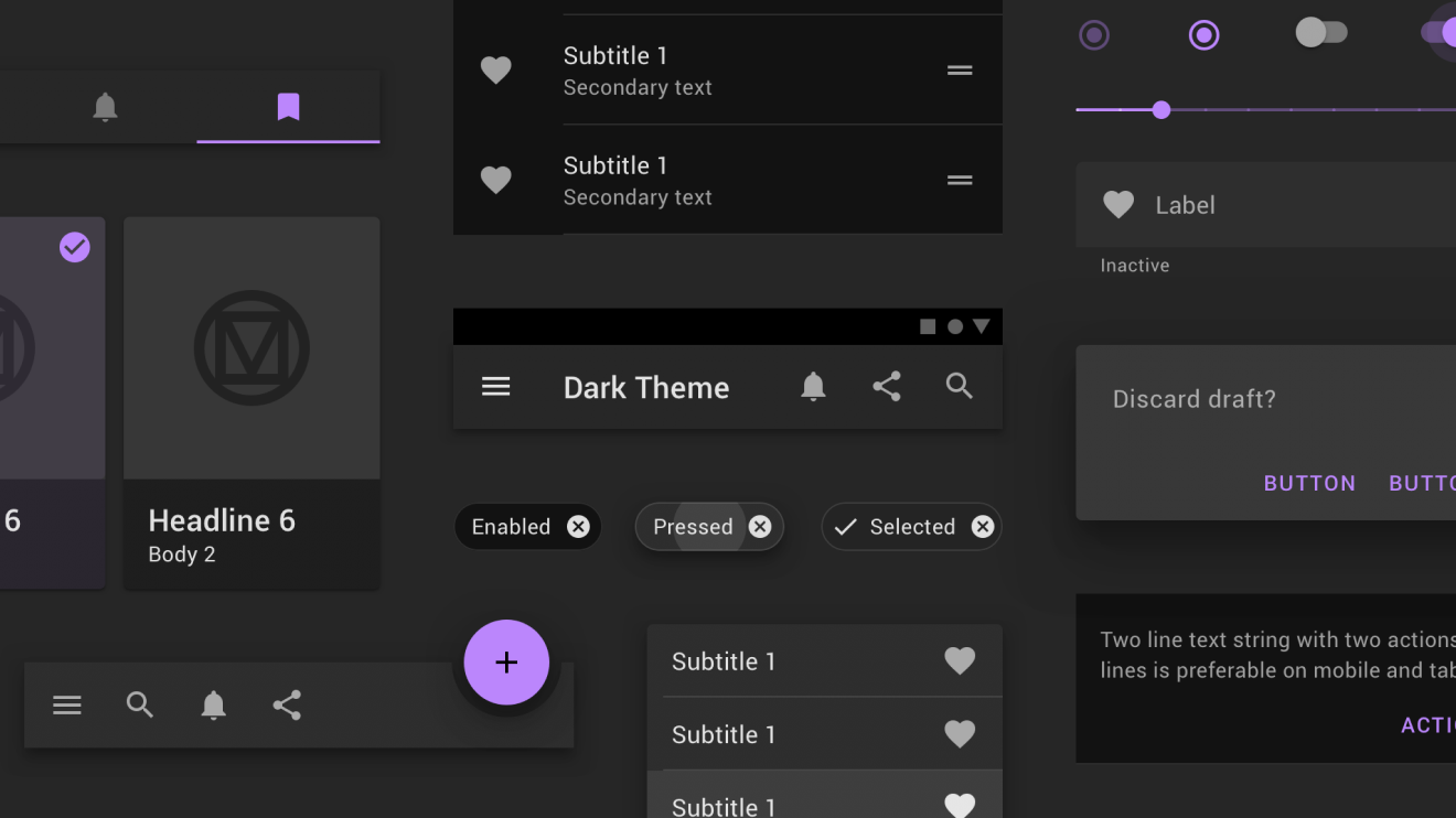
I’m strictly a dark mode user. Practically every app or digital platform I use, day-to-day, comes with a dark mode UI option. Even the NHS Test & Trace app has a dark mode. I can’t explain why, but it seems absolutely clear to me that dark mode is just better (sorry light moders, you’re wrong).
There are a few who continue to resist the rise of dark mode, however. Most Google products don’t have the option, for example, although that looks set to change soon.
So, where did this movement towards dark user interfaces come from, and why do people feel so strongly about it?
A brief history of dark mode
Once upon a time, there was only dark mode. The earliest computer monitors, powered by cathode ray tubes (CRT), were monochromatic by default. It was not until the release of the Apple II in 1977 that primitive colour displays started to appear in personal computers. Even then, it was not until the late 1980s that computer interfaces began to enjoy a wide range of colours.
Strangely, while these early computers may have lacked colour, they did enjoy a technology we’re very familiar with today – touchscreens, as seen with the Fairlight CMI released in 1979.
We’d stick with these CRTs through to the mid-noughties until slimline liquid crystal display (LCD) screen technology ushered in a revolution. Seemingly overnight, big, boxy CRTs were replaced by elegant flat screens. While Apple’s original CRT-based iMac is regarded as an icon of industrial design, the LCD based iMac G4 – released only 4 years later – was arguably the bigger step, taking Apple in a radical new direction.

LCD screens are still widely used today (chances are you’re reading this on one, in fact) but they are being supplanted by organic light-emitting diode (OLED) panels.
OLED screens are expensive, but because each pixel in an OLED panel emits its own light and can be turned on or off individually, they deliver deeper blacks than LCD screens (perfect for that sleek dark mode UI design). This per-pixel lighting also means OLED displays conserve power when displaying darker colours.
As screen technology has improved and panels have got brighter, concerns and complaints about eye strain have started gaining momentum, leading, in part, to the rise in interest in dark mode UI design.
Dark mode evangelism
Dark moders proselytize the cause across the internet by touting a range of benefits; longer battery life, improved legibility, improved focus and reduced eye strain. But, do any of these claims actually hold water?
Well, in terms of battery life, yes they do. Experiments show that enabling dark mode on an OLED equipped device can net an energy-saving of up to 24%. The catch is that OLED based screens haven’t penetrated very far into the market yet, meaning only users on high-end devices such as an iPhone 12 or premium gaming laptop will see any benefit.
When it comes to legibility and eye strain, things are far less clear cut. Anyone who sits through a class on the fundamentals of UX design has it hammered into them that black text on a white background is the ideal in legibility – there’s a reason you’ve never read a novel with white text on black paper.
Indeed, studies have repeatedly shown that subjects have better reading comprehension and make fewer entry errors reading dark text on a light background, compared to reversed conditions.
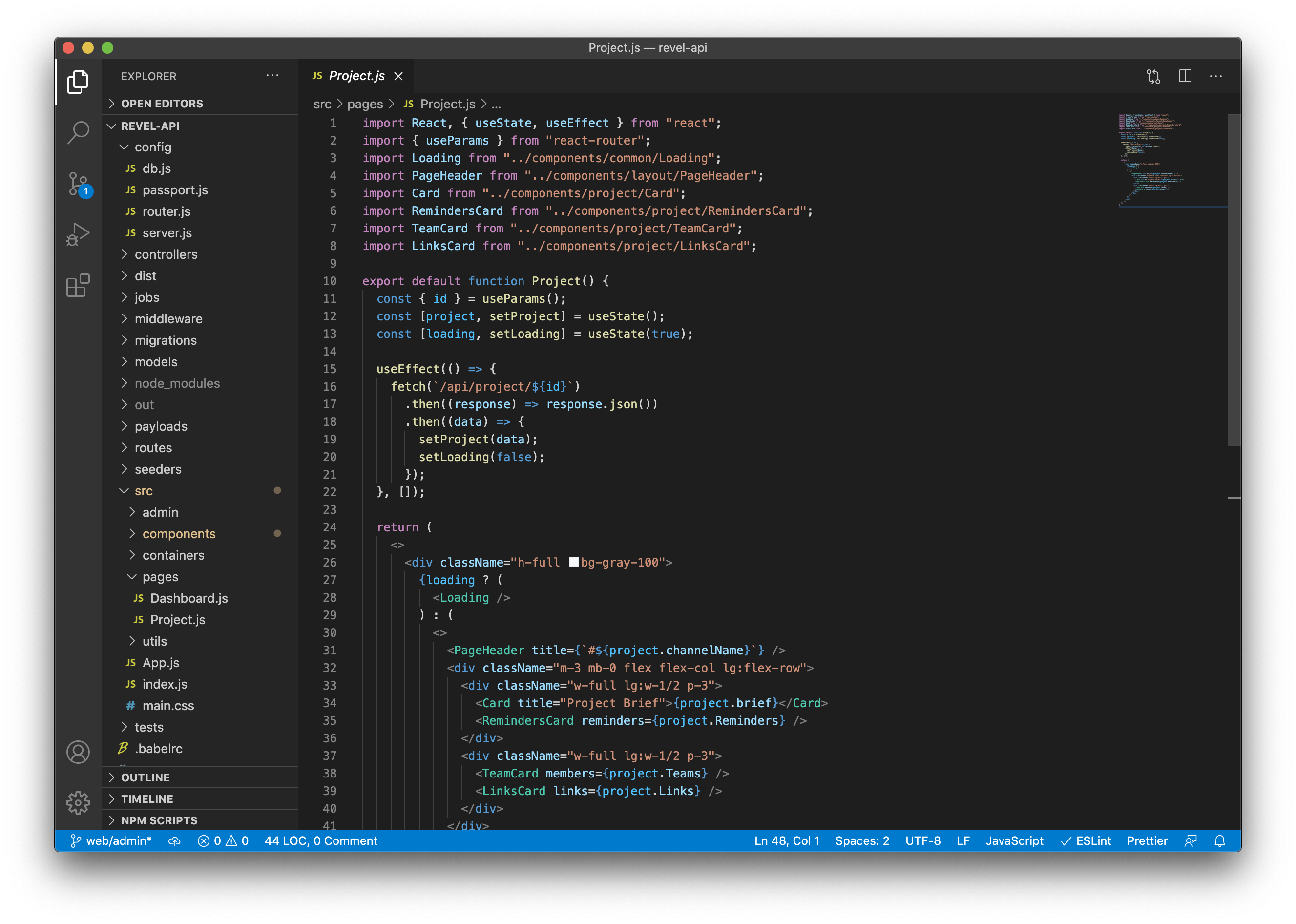
However, there are exceptions. Many code editors, from Vim to VS Code, default to dark mode. Code is, by definition, visually complex. By using dark mode, these editors can help users focus on individual parts of a screen, providing somewhat of a visual respite from overstimulation. Colours, which stand out against the contrast break up complex blocks of code into something easier to scan.

Impact on UI design
As digital product and app developers, we need to be considerate of UI design trends and user preferences. However, we also need to make the best use of our time and resources. Is adding a dark mode to an app MVP really a worthwhile use of the clients budget?
Mostly, this will depend on the use case. As we’ve established, dark mode can sometimes be a hindrance to comprehension and entry accuracy. We couldn’t, therefore, recommend it for apps where entry errors could have big consequences, such as online banking services or digital tax or regulatory platforms.
In other instances though, you may wish to turn to UI design to influence user behaviour. For example, Twitter found that users spent more time in-app with dark mode enabled, so if user engagement were an important metric for your product, the case to implement it would be stronger.
A matter of personal preference
Of course, for users often it all comes down to personal preference. The reason I use dark mode isn’t that I care about my eyesight or battery life, it’s an aesthetic preference – I just like the way it looks.
With the release of iOS 14, Apple, a company who traditionally controlled their product’s design with an iron fist, opened the doors for users to add custom icons and home screen widgets. Maybe one day soon, instead of choosing between light or dark mode – we’ll be able to create whatever theme we like.