SVG Gradients: Solving Curved Challenges

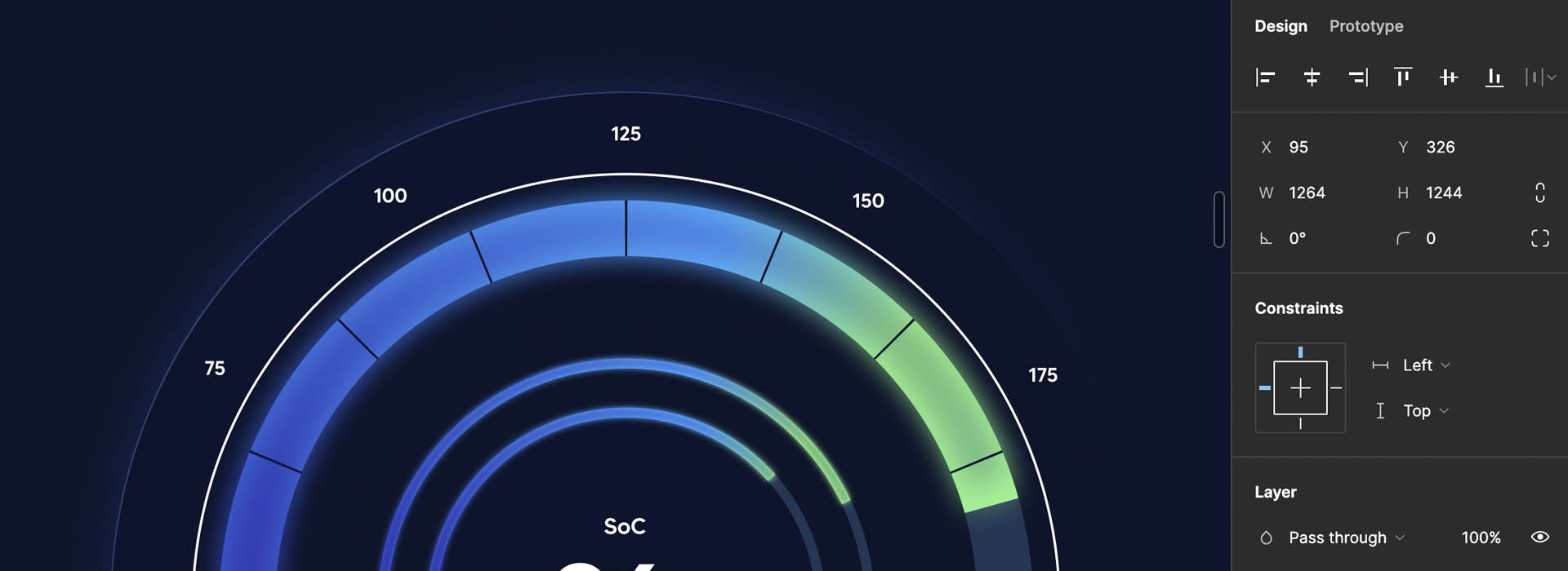
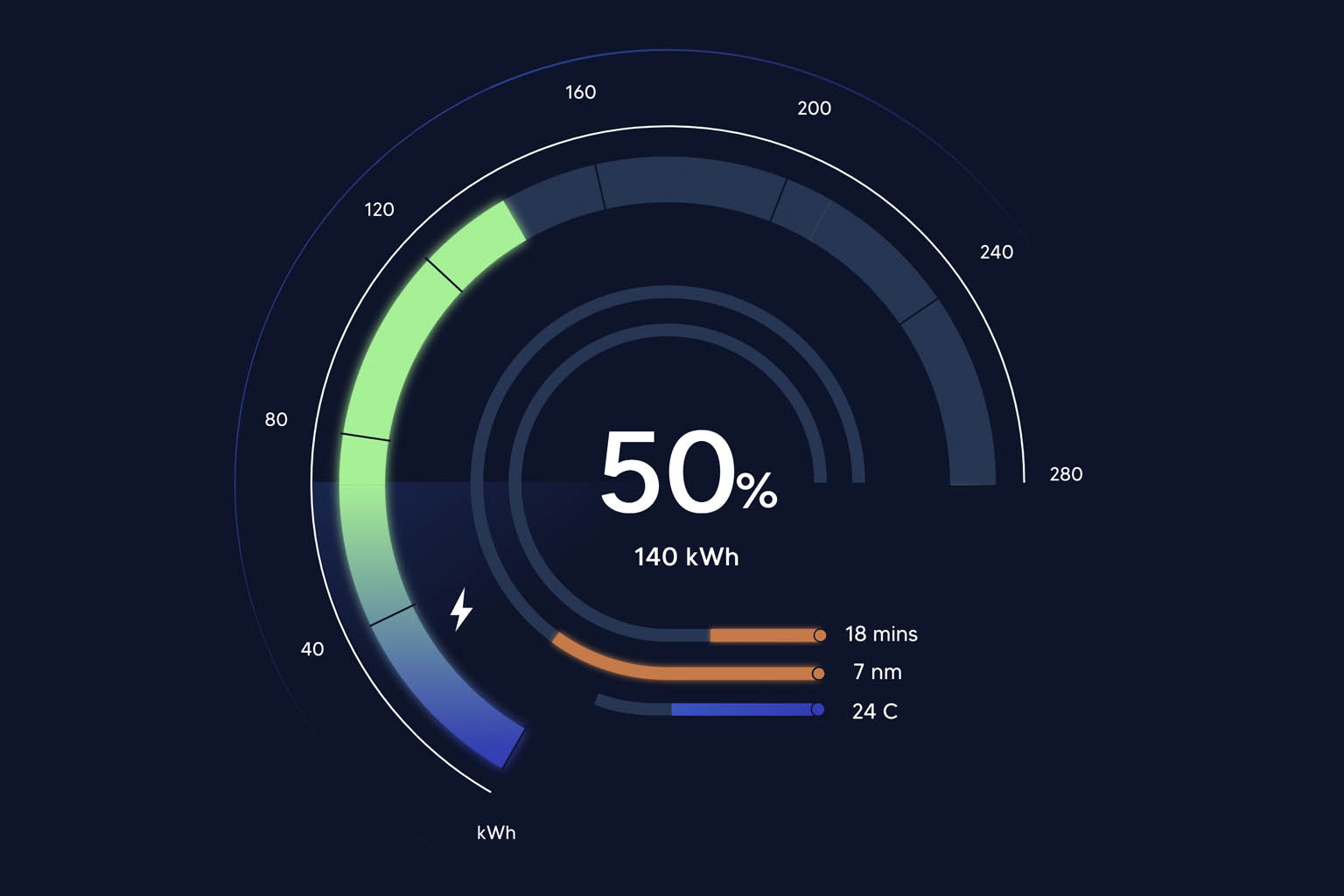
In the world of programming, seemingly straightforward tasks can unravel into complex challenges. Recently, we encountered one such challenge while attempting to transform a Figma design into code. The task at hand involved creating a radial dial with a linear gradient – a seemingly simple requirement that soon proved to be more intricate than expected.
In this post, we’ll delve into the world of SVG gradients and explore the solution we devised to tackle the challenges that arose, and argue why sometimes, being given complex engineering challenges like this can be highly rewarding.
Thrown a curveball
At first, it seemed simple. There must be a library we can use to create the dial and apply a linear gradient to it. How hard could it be?
And after a quick search of investigating libraries such as High Charts and FusionCharts we did find libraries capable of creating radial dials as well as generating linear gradients using SVG. However, the real complexity emerged when attempting to combine these two elements seamlessly. The obstacle lay in the nature of linear gradients defined within SVG. By default, linear gradients transition between colours along a straight line. When applied to the stroke of a circular path, the gradient’s direction remains linear, disregarding the curve of the circle.
Consequently, if we were to apply a linear gradient to a complete circular dial created with a single curve, the gradient would follow a straight path rather than the desired radial path along the dial. That wouldn’t achieve the curved gradient that we were looking for – so it was back to the drawing board.

Breaking up the problem
Instead, to achieve the effect of a smoothly transitioning gradient encircling the radial dial, we realised we needed to break the dial into multiple sections and apply distinct gradients to each section.
In our example, we divided the dial into four sections, each assigned its own linear gradient. By thoughtfully selecting the colours for the gradient stops, we were able to create a continuous gradient appearance around the dial.
Here, we start to see how we can construct a radial dial in SVG. The “d” attribute defines a path to be drawn. In this case, it’s specifying the path for the first quarter of our radial dial
The ‘M’ stands for “Move To” and sets the initial point of the path at the coordinates (150,10). The ‘a’ command creates an elliptical arc. This arc command has several parameters. The first two parameters, ‘120 120’, set the x and y radius of the ellipse used to draw the arc. The ‘0 0 1’ defines the x-axis rotation (which is zero), large-arc-flag and sweep-flag. The final ‘103.9230 60’ sets the end point of the path, which completes our arc. We then apply the gradient with the stroke attribute on the path.
This process is repeated for each quarter of the dial. Each quarter gets its own path and its own gradient. This gives the effect of a single, smoothly transitioning gradient circling around the dial.
Dynamic Gradient Filling
To dynamically fill the gradient along the dial, we leveraged the stroke-dashoffset and stroke-dasharray properties of the SVG path. This technique is commonly employed when creating radial dials. CSS tricks has an in depth write up on the approach: SVG line animation works.
By setting the stroke-dasharray equal to the length of the path, we established a pattern of dashes and gaps resembling a dotted line encircling the circle. The stroke-dashoffset property determined the starting point of the dash pattern, effectively animating the stroke’s movement. By animating the stroke-dashoffset from the start of the path to the length of the path, the dash appeared to “travel” around the circle.


Embracing Complexity (Sometimes)
While complex designs can translate into difficult technical challenges, they also serve as opportunities for programmers to hone their problem-solving skills. This is an integral part of what keeps programming interesting, at least for me.
The complexities we face in programming often reflect the complexity of the designs we’re working from. Our Figma design, featuring a radial dial with a linear gradient, serves as a great example of how a visually appealing design element can introduce significant technical challenges.
It’s easy as programmers to instinctively try and work with designers to come up with a compromise in terms of design spec. In fact that’s often the right approach. But sometimes, if you want your designs to stand out from the crowd, you’ll need to instead push past your comfort zone and come up with creative ways of solving your problems.
Another way to put this is, while design complexities can translate into technical challenges, they also serve as opportunities for programmers to hone their most valuable skill, their ability to problem-solve.
