Royal United Services Institute
Enhancing data analysis for analysts worldwide with our data-driven UX design and modern development
The Royal United Services Institute (RUSI) is a global leading think tank based in London, providing Governments and News outlets with data and analysis on international risk and security, including critical work in cyber security. The institute’s work addresses the evolving digital threats that impact global security, economic stability, and public safety. RUSI’s experts explore topics such as cyber crime, digital resilience, and the development of cyber norms. The analysts at RUSI provide valuable insights into how countries can protect against cyber threats, enhance digital defences, and navigate the complex landscape of cyber governance.
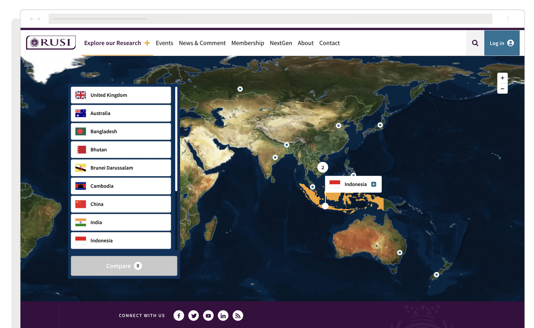
To complement the latest data in global cyber security we were asked to design an interactive web-based comparison platform for the Governance of Cyber Security in specific regions across the globe.
The Brief
The primary goal of our project was to create a user-friendly interface design and experience that offers access to the latest cyber security governance information across specific regions. The information had to be not only searchable but also systematically organised according to key themes, allowing simultaneous data exploration across different countries by journalists, analysts, and government departments for in-depth comparison. To boost user engagement, it also required an intuitive interface design that allowed for the seamless navigation of an interactive map across an array of screen sizes.
User journey mapping
Our initial step was a short dive into research, exploring innovative ways to present complex information without losing clarity or functionality, whilst remembering that the solution had to be engaging across all screen sizes. This UX research acted as a beacon for the team, guiding our user journey mapping and ensuring our concepts were both practical and user-friendly.
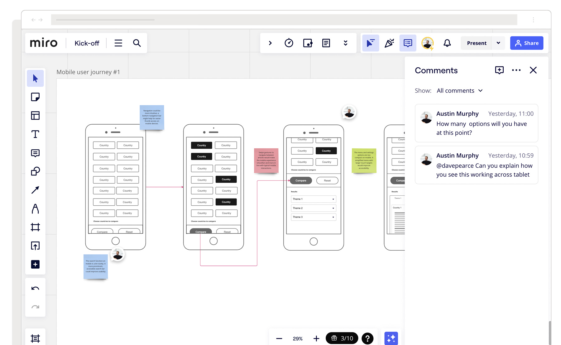
Fueled by our findings, we first focused on mapping out an intuitive user journey. Working with the RUSI team regularly, our approach was collaborative and creative, prioritising ease of navigation and comprehensive data interaction. This exploratory process transformed the challenge into an opportunity, our approach to categorising the data into a progressive format allowed users to effortlessly explore the intricate data, making every interaction not just informative but also a delight, regardless of the device used.
Prototyping and testing
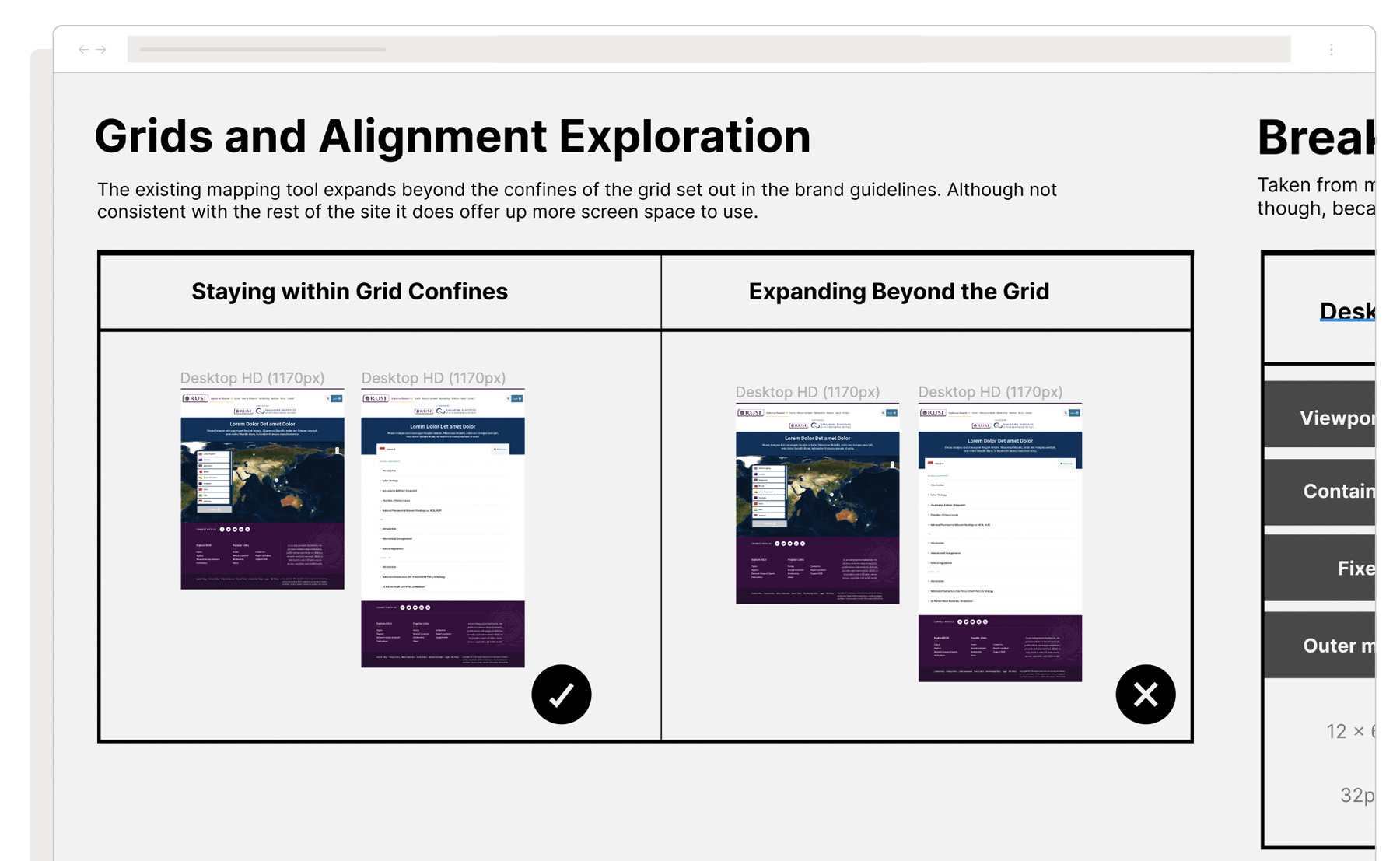
Our early-stage UX prototyping truly shone in this project, playing a pivotal role in uncovering early usability issues, especially when juggling vast amounts of data on mobile devices. This approach was a game-changer, by allowing us to rapidly create concepts and test them, it significantly cut down the amount of time from concept to proven concept. All whilst boosting the user experience and ensuring our prototypes perfectly matched user expectations. It was all about giving concepts a test run with actual users before diving into the design process – a kind of ‘try-before-you-buy’ method that proved incredibly effective.
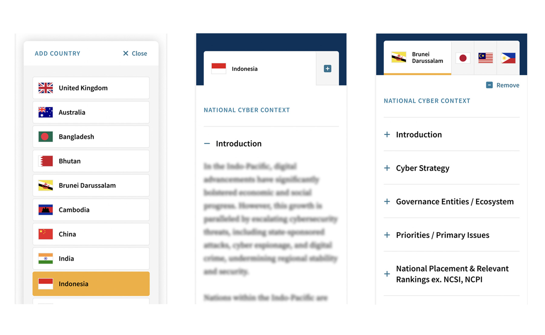
Given the nature of the data and our wider audience, we left no stone unturned in testing and perfecting every detail within the interface design. From initial wireframes to sophisticated high-fidelity prototypes, each step was an exciting opportunity to refine and enhance. It was a journey marked by collaboration, innovation, and a steadfast commitment to delighting our users.
Developing the interface design
RUSI already boasted a sophisticated and well-established design system, making it a breeze for us to dive straight in. Naturally, we encountered a few hurdles along the way, like the usability of the interactive map. The challenge was finding a sleek way to display clustered locations across specific regions when in a zoomed-out view. This clustering issue was a puzzle we had successfully solved in a previous mapping project – Insights. Drawing on that experience and the success we enjoyed there, we again chose Mapbox for our mapping services. Our familiarity with its advanced features meant we could hit the ground running, significantly speeding up our project’s momentum.
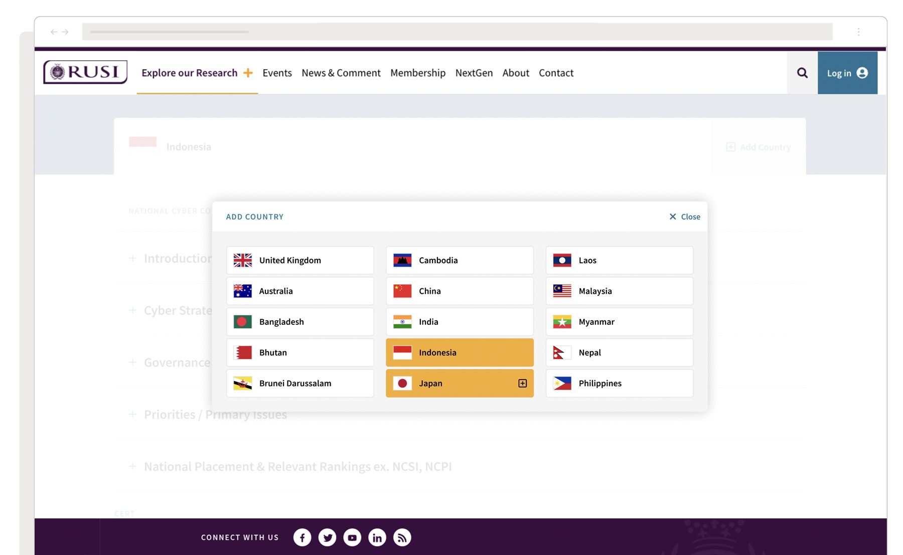
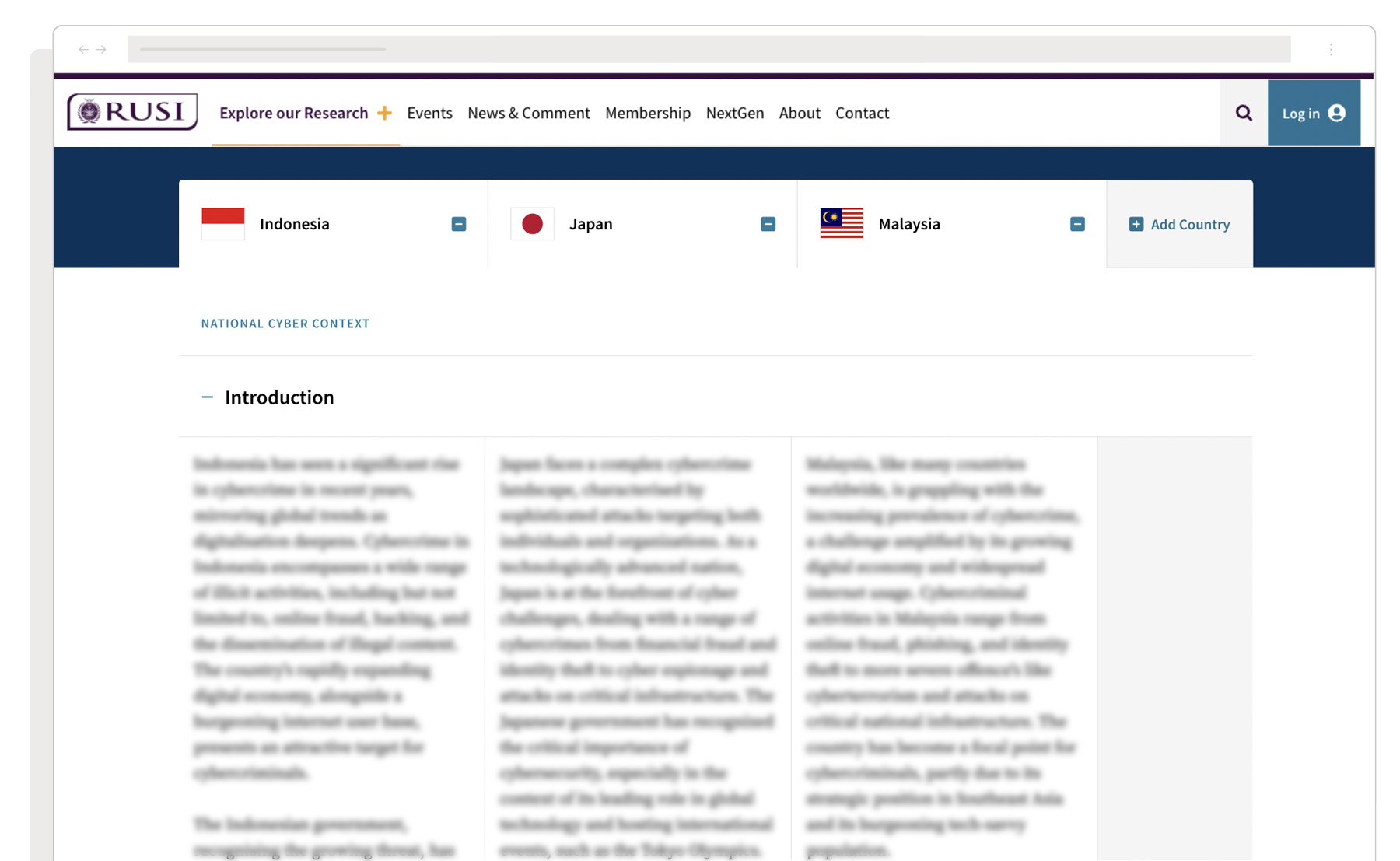
As we forged ahead, we developed new interface components designed to seamlessly integrate with the existing design system. We crafted the structure and implementation of these components to ensure they could be easily incorporated into RUSI’s broader design ecosystem if required. This approach ensured our project was not just a one-off endeavour but a meaningful contribution to the organisation’s digital landscape, enhancing value for the organisation and the teams within it, making every step of our journey an exciting blend of innovation and strategic foresight.
Handing it over to IT
With our development team by our side throughout the process, we swiftly transitioned the Figma files into a standalone web app built in ReactJS and Tailwind. The outcome was a modern, fast, and super slick user experience across all screen sizes.
The last piece of the puzzle was ensuring everything was handed over to our client’s IT team in a nicely documented package, and ensuring they were fully equipped with everything they needed to integrate the web app into their wider ecosystem. We took a detailed, step-by-step and personal approach that included comprehensive release notes alongside personal one-to-one guidance. This move was a hit with the IT team who were able to dive straight into integrating it without the need for lengthy meetings.
Our approach not only facilitated a smoother workflow but also fostered a sense of collaboration and efficiency, making the entire process a joy for everyone involved, including our client.