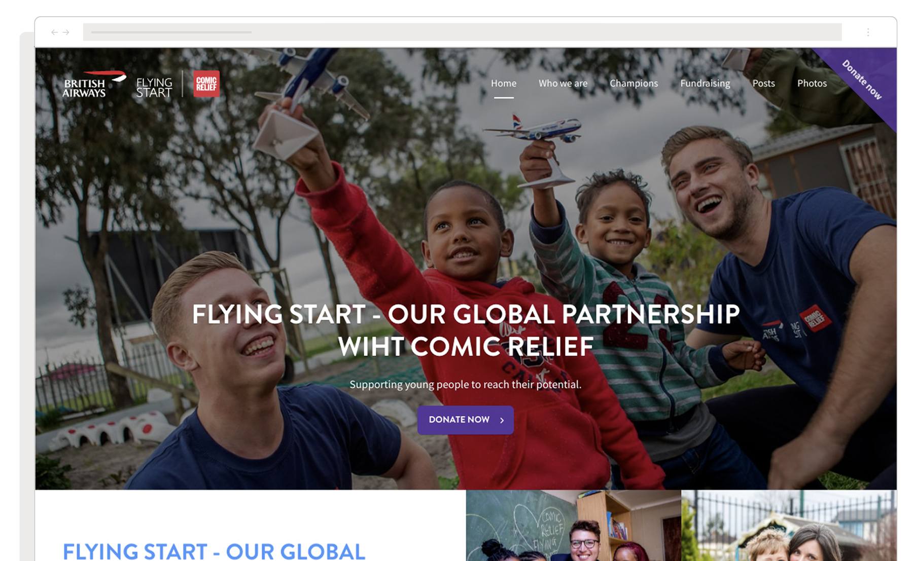
Comic Relief & British Airways
Transforming Comic Relief’s Flying Start Website and Donation platform
Comic Relief, the charity behind Red Nose Day, partnered with British Airways for their “Flying Start” campaign. This global initiative aimed to raise money to help children living in incredibly tough circumstances. By the time Browser London was approached, the campaign had already raised an impressive £12.5 million. By 2023 it had reached a massive £29 million!

The Brief:
Comic Relief approached Browser London to develop a new user experience design and develop it into an integrated website and donation platform for the Flying Start partnership with British Airways. The existing system was slow, outdated, and had become labour-intensive to maintain. Its performance was limiting fundraising potential.
It was time for a complete redesign.
Discovery:
During the initial investigation, we identified that many of the system’s tasks could be automated using modern web services. We determined that the new website needed to perform three key functions:
1. Highlight the engaging and inspiring story.
2. Create an effortless pathway for public donations.
3. Deliver a cost effective solution.
Design:
Based on our discovery findings, we shifted the project scope to focus on creating a publicity-oriented website. We utilised modern web features such as Flexbox for adaptive layouts, SVG sprites for accessible icons, and path clipping for creative grid systems. This approach allowed us to create an attractive and engaging user experience without the browser constraints of the past.
We employed a user-centred design process, starting with quickfire wireframes based on real content. These wireframes were presented to users for feedback, allowing us to iterate quickly and develop prototypes for further testing.
Our agile approach enabled us to cater to both British Airways staff familiar with the campaign and general public users who might arrive from the main British Airways website. We ensured every page had prominent ‘Donate now’ buttons in the header and footer, along with clear signposting to boost user confidence and encourage donations.
Outcome:
The project delivered several significant benefits for the client:
Improved Performance: The new website loaded and performed smoothly even on poor connections, enhancing the user experience globally.
Cost-Effective Solution: By leveraging third-party services and modern web technologies, we created a powerful platform without the need for expensive custom solutions. Our solution saved at least £10,000.
Enhanced User Engagement: The intuitive design and clear information architecture made it easier for users to find information and donate, potentially increasing fundraising effectiveness.
By combining strategic thinking with efficient design and cutting-edge web technologies, we delivered a solution that not only met the client’s immediate needs but also provided long-term value for their charitable initiatives.