The Art of Dashboard UI Design – Empowering Organisations with Actionable Insights

In my years of experience in UI design and development, I’ve learned a crucial lesson: having data isn’t everything.
Being able to understand data is everything.
As organisations scale their operations, they often find themselves inundated with vast amounts of information. This abundance of data can be overwhelming, making it challenging to effectively process and utilise the information. The key question becomes: how do we transform this wealth of data into actionable insights?
This is where well-designed dashboards come into play. They serve as powerful tools for visualising complex data and enabling quick understanding across all levels of an organisation. In this article, we’ll explore how to harness the power of effective dashboard UI design to empower organisations with actionable insights. We’ll cover:
- The power of effective dashboard UI design and its impact on organisations
- Understanding user needs and context in dashboard creation
- Choosing the right visualisations for different types of data
- The distinction between viewing data and interpreting data
- The iterative process of dashboard UI design and the value of user feedback
Let’s dive into each of these aspects to uncover how we can create dashboards that truly empower decision-making and drive organisational success.
The Power of Effective Dashboard UI Design
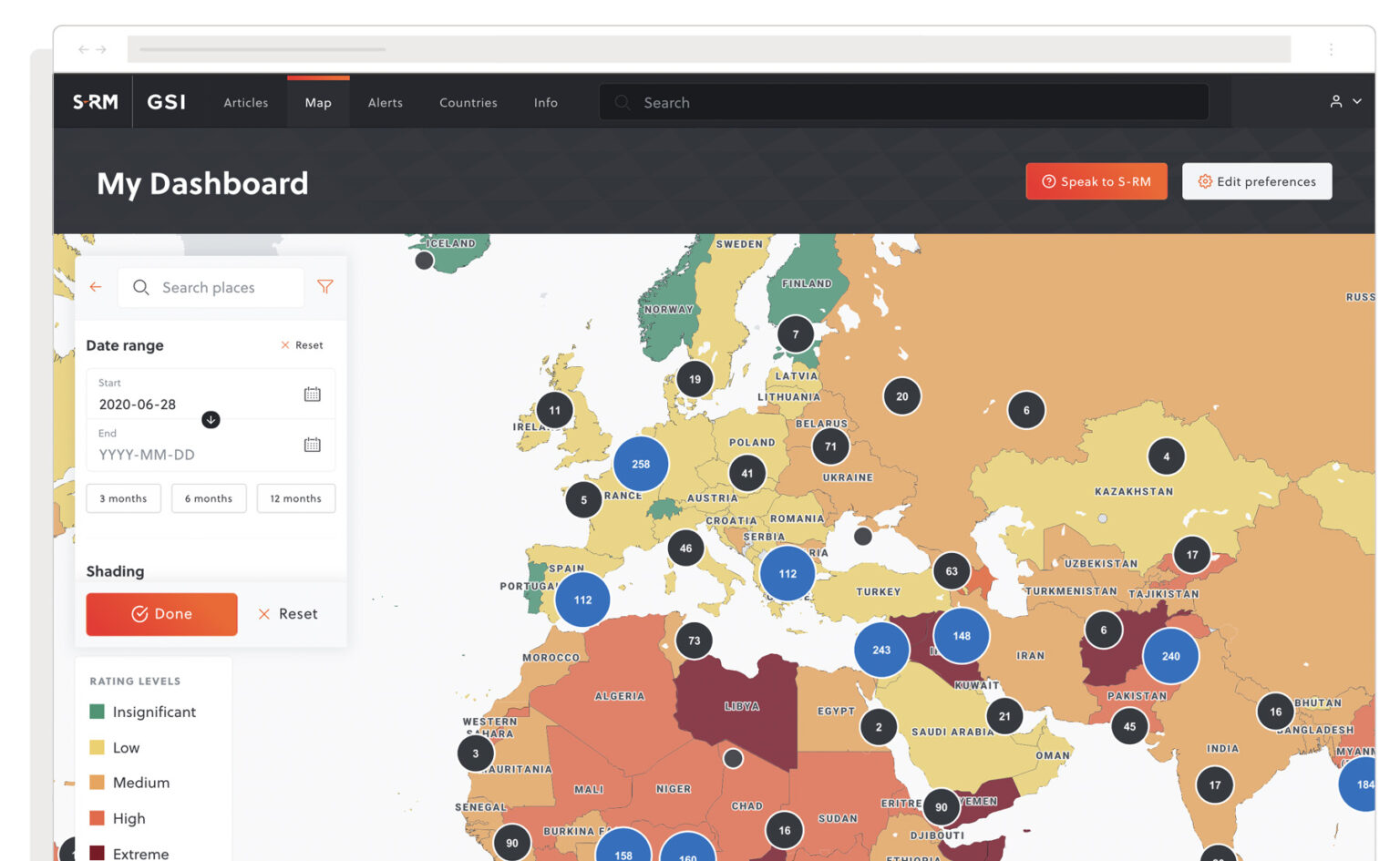
If a dashboard acts as a window into an organisation’s performance, then ensuring that window is crystal clear is achieved through well-designed presentation of relevant data. In the B2B context, I’ve observed how dashboards play a key role in helping organisations monitor their operations, track progress towards goals, and identify areas for improvement. By presenting data in an easily digestible format, dashboards empower employees at all levels to make informed decisions quickly and efficiently.
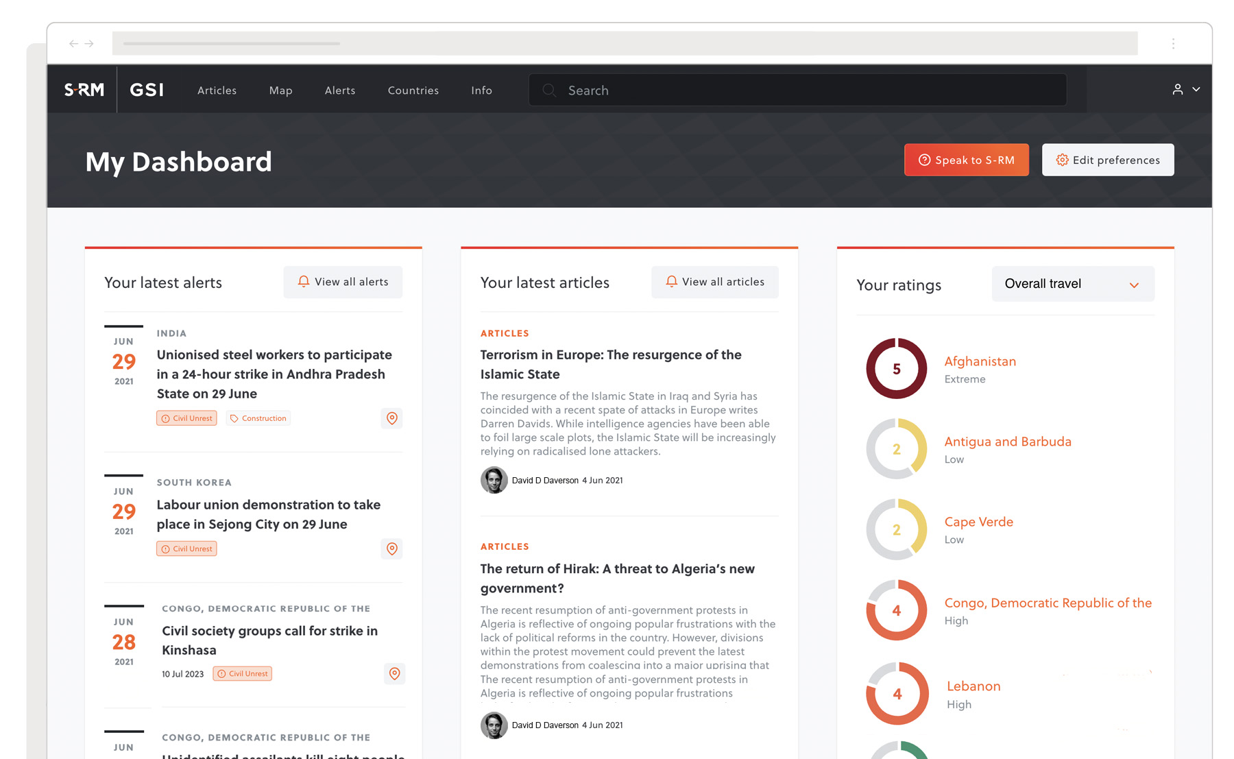
For several years I worked with a global insurance provider, I witnessed firsthand how effective dashboard UI design can transform an organisation’s approach to data. The client’s hands were full of risk data but they lacked the means to make this valuable information more readily accessible to analysts. By implementing a user-friendly business intelligence platform called Insights, we significantly enhanced the employee experience, allowing analysts to easily understand and utilise data from multiple sources within a single, user-friendly interface.
Designing an effective dashboard requires a deep understanding of the organisation’s goals, the needs of various stakeholders, and the principles of data visualisation. Let’s explore some key considerations for creating impactful B2B dashboards that drive actionable insights.
Understanding User Needs and Context

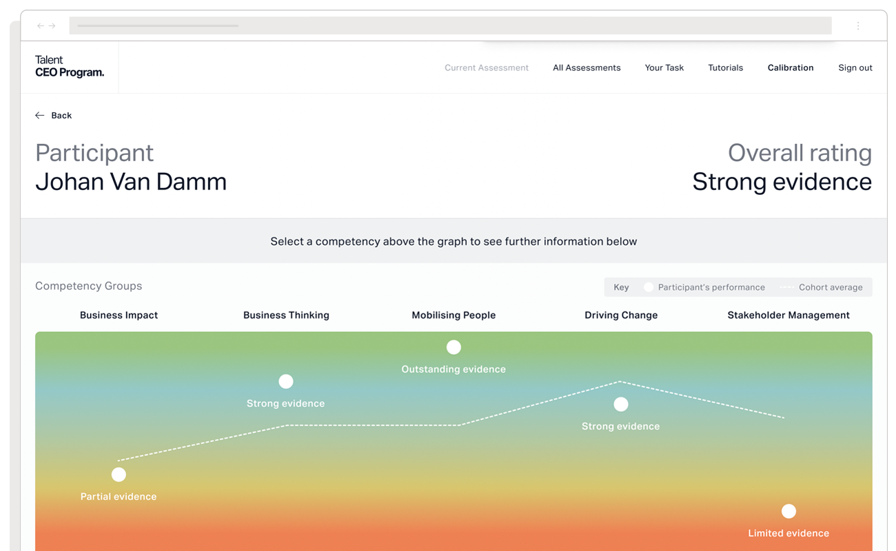
Before diving into the design process, I always emphasise the importance of understanding who will be using the dashboard and for what purpose. Different roles within an organisation may require different types of information and levels of detail. For instance, I’ve found that executives often need high-level overviews of company-wide performance, while department managers may require more granular data specific to their areas of responsibility.
In the Insights project, we conducted a comprehensive assessment of the organisation’s data needs. This involved a deep research project, interviewing underwriters, analysts, and clients to understand how the company calculated risk.
“Our initial workshops highlighted the need for users to create their own dynamic display of information, and track any changes that occur within related geographical locations”
John, Strategy Director
We examined the entire user workflow, from client requests through analysis to the final report. By understanding the needs of the insurance provider’s workforce, from analysts to regional specialists, we were able to design a dashboard solution that truly empowered employees at all levels.
Choosing the right visualisations
Once you’ve identified your users’ needs, the next step is selecting the most appropriate visualisations to represent your data. The choice of charts, graphs, and other visual elements can significantly impact how easily users can interpret the information presented. Let’s explore some popular visualisation types and when to use them, keeping in mind the specific needs of different user groups:
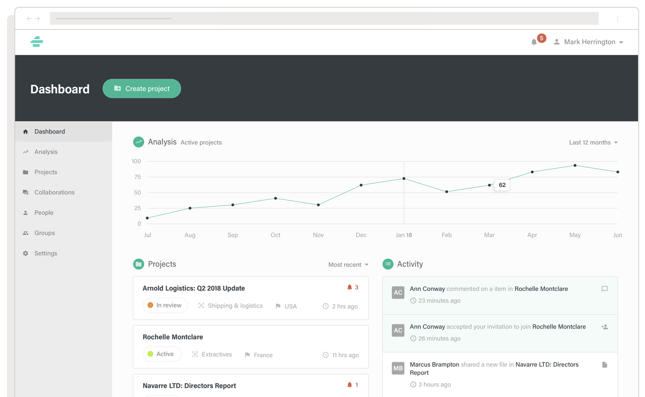
Bar charts: Ideal for comparing values across categories. These are particularly useful for executives who need to quickly compare performance across different departments or product lines.
Line graphs: Excellent for showing trends over time. These can be invaluable for managers tracking progress towards goals or identifying seasonal patterns in their data.
Pie charts: Useful for displaying proportions of a whole, though I use these sparingly. They can be effective for high-level overviews, such as showing budget allocation to different departments.
Heatmaps: Effective for highlighting patterns in complex datasets. These can be particularly useful for analysts dealing with large amounts of data, such as customer behaviour patterns or geographical distribution of sales.
Gauges: Great for showing progress towards targets. These can be motivating for teams tracking KPIs or for executives monitoring overall company performance against goals.
When choosing visualisations, always consider the type of data you’re presenting, the relationship you’re trying to show, the message you want to convey, and the audience’s familiarity with data visualisation.
The Importance of Iteration and Feedback
I’ve learned that dashboard UI design is an iterative process. Once you’ve launched your initial dashboard, I recommend gathering feedback from users and monitoring usage patterns to identify areas for improvement. Regular updates and refinements based on user input can help ensure your dashboard remains relevant and valuable over time.
In the First Quantum project, we implemented a pilot phase prior to the global launch of the platform. Test users from partner firms were encouraged to experiment with the new functionality and provide feedback. This real-world testing process produced a set of additional requirements and UX tweaks that were vital to making the finished product a success. It also helped us gather valuable insight into how much training users would need, ensuring a smooth rollout of the new way of working across thousands of professionals worldwide.
Viewing Data vs Interpreting Data
Data visualisation is as much about storytelling as it is about calculated decision-making. Whether you’re winning stakeholders for a specific initiative or trying to uncover the story behind certain ups and downs within the data, understanding the difference between viewing data and interpreting data is key to interacting with a dashboard.
Viewing data is about seeing the numbers and trends presented. Interpreting data, on the other hand, involves understanding the context, identifying patterns, and drawing meaningful conclusions. A well-designed dashboard should facilitate both. It should present data clearly for easy viewing, but also provide context and tools that aid interpretation.
For example, in the Portal project for a business intelligence consultancy, we didn’t just display metrics. We incorporated features that allowed analysts to pack messages, documents, and reports into an intuitive, shopping basket-based encrypted dossier with a few clicks. This turned the dashboard from a simple data viewer into a powerful tool for secure information exchange and interpretation, allowing professionals to share high-level content, manage projects, and get work done efficiently.
Truly understanding and defining the objectives of the end-users at the start of the project was key. It gave us the strong foundation we needed to make sure we delivered value for the client.
James, Technical Director
Ensuring data accuracy, timeliness, and ethical presentation is crucial for maintaining trust in dashboards and their insights. This involves implementing robust data validation processes, clearly communicating data sources and update frequencies, and addressing potential biases through transparent representation, such as providing context, confidence intervals, or stating data limitations.
My Final Thoughts
In our data-driven era, effective dashboard UI design is a game-changer. It’s about more than just presenting information—it’s about transforming how organisations understand and use their data. By creating interfaces that truly resonate with users’ needs and employ smart visualisations, we’re not just displaying numbers; we’re enabling genuine insights.
UX design should be invisible to the user. Good design allows the user to engage without having to think about it. The insights provided by the discovery research phase allowed us to design an application that performed just that.
Iain, UX Designer
This approach to dashboard UI design speeds up decision-making and boosts efficiency across entire organisations. It turns the challenge of abundant data into an opportunity for clearer thinking and smarter choices. Whether you’re running a small startup or a global corporation, these principles can help you turn complex information into a valuable asset.