How a web-based document portal saved Mondottica time and money
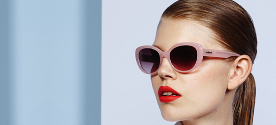
Mondottica designs and manufactures designer glasses on behalf of global brands such as Converse, Ted Baker and Hackett. They distribute these to opticians all over the world and one of their roles as a distributor is to supply opticians with the marketing material for the brands that they stock.
With clients all over the world, distributing multiple brands’ marketing material is no easy task. Mondottica had already decided to do this digitally, however, their current system was slow and inefficient, requiring a single person to send retailers individual links to access their required marketing material.
As part of the work, we built the company a web-based document portal that encouraged self-service and made the process far more efficient, saving staff time, and Mondottica money.
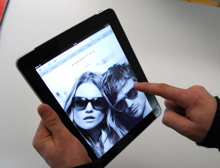
Our Solution: The Mondottica Hub
The Mondottica Hub is a web-based document portal designed to enable Mondottica to share multiple files with thousands of users.
Mondottica’s clients are able to login and access the marketing materials for the brands that they sell. Once Mondottica has uploaded the relevant files to the portal, opticians are able to download marketing material whenever and wherever they are, and from any device. Best of all, it requires no more work for Mondottica’s team.
The application is developed around a permissions-based access model. This means that Mondottica can decide which files each optician can access and which they can’t, just by ticking a few checkboxes.
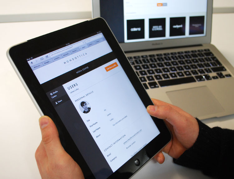
We also developed a sophisticated search function using Elasticsearch technology to allow users to search by partial SKU codes. This means that users are now able to refine their search by brand, season, year, colour and range.
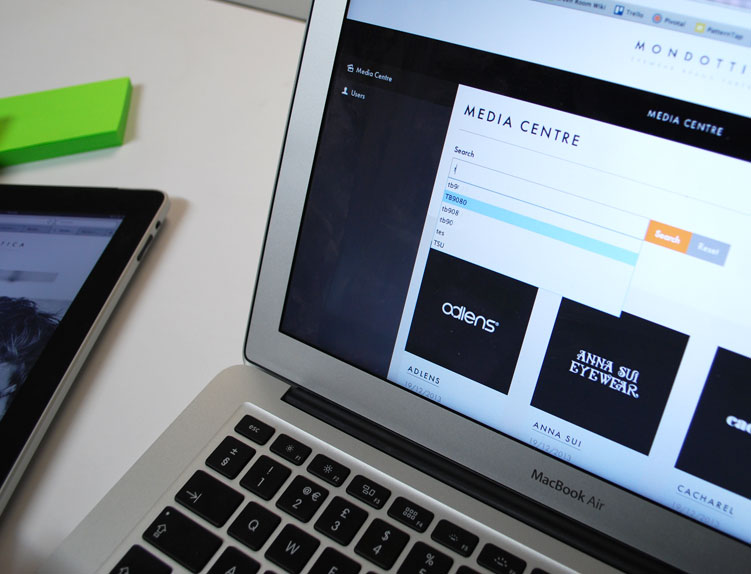
We paid special attention to the user interface design of the portal to ensure that the user experience was of the highest standard in terms of both looks and performance. The Hub is all part of the service that Mondottica provide for their clients, so ensuring that the UX was intuitive and simple was a priority.
With this in mind, our responsive design approach means that the web-based document portal can be accessed on any device, be it a smartphone, tablet, desktop or even smart TV, if you’re so inclined. This approach also ensures the platform is ready for future devices.
Of course, for consistency, The Hub was skinned with Mondottica branding to ensure a smooth user experience from the company’s website, which we also designed.
The Website
In addition to the Mondottica Hub we designed and developed their new website. Being a fashion design company, www.mondottica.com needed to look the part.
Working with the Mondottica team on a weekly basis we began by compiling user stories, matching those against Mondottica’s business objectives as we progressed through the planning, design and production stages.
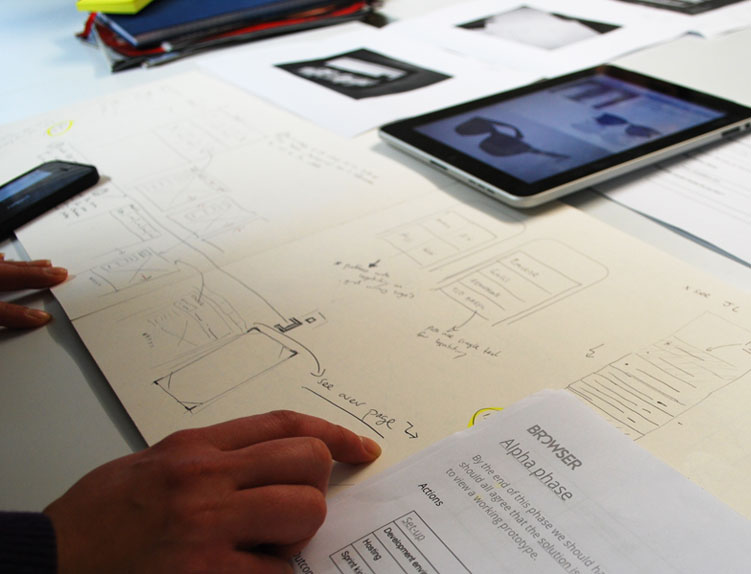
The new website makes the most of big, high-quality images and keeps things clutter free with plenty of white space, whilst making sure that it remained lightweight enough for mobile users. As always, we ensured that the information architecture was correctly planned so each page delivered exactly what was required by the user.
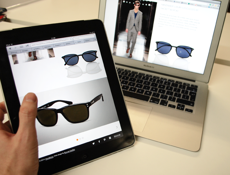
James did a great job putting some nifty transitions into the site and also ensured that the website could be translated into multiple languages for the international Mondottica offices and clients.
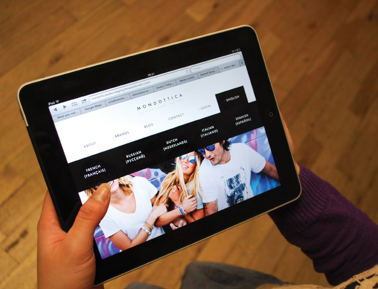
We used a one web approach for the design of both the website and the hub so all of Mondottica’s digital assets are accessible on any device. Visit the site and try resising your browser window to see this in action.