How to improve user experience design with transitions

‘Fluidity’ and ‘immediacy’ are words not historically used to describe the user experience design of websites and web apps. More likely they will be adjectives you’d use when discussing native apps, and mobile apps in particular.
Enter transitions
Transitions (an animation between two states) are so ubiquitous on our mobile devices we barely notice them, yet if one were to remove them, the change to the user experience would be so jarring, the entire platform would feel clunky and slow. The power of transitioning between two states should never be overlooked and I believe it’s a fundamental part of the user experience design that can make web apps a superior alternative to native applications.
The problem for users
Whether it be transitioning between an “open” and “closed” state of a navigation menu or the method in which new content enters the page when a user scrolls; transitions have the ability to reassure users that the website they are using is working as expected.
It may sound strange, but a byproduct of a transition-less website is the user missing the change they were expecting. If a button has been pressed, it is a perfectly reasonable expectation to see something happen. Yet if the change is instantaneous, it can slip below the radar causing a user to repeat the action, leading to a poor user experience.

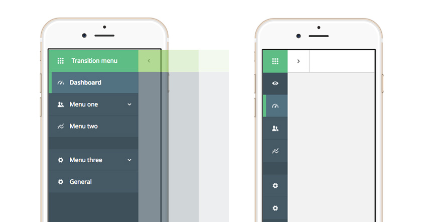
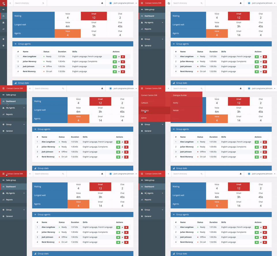
Transitions within a navigation system help to reassure users the product is working correctly
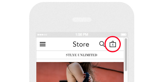
I have experienced this problem quite regularly when using e-commerce websites. Picture the scene: You’re on your clothing website of choice scrolling through a long page of products. Something of interest catches your eye and you choose to press the familiar “Add to cart” button. In most cases at this point, your shopping cart will now show a “1” next to it.

Subtle transitions help improve the user experience by reinforcing assurances
This is such a subtle change in state, it can often be missed and the action unnecessarily repeated – particularly on mobile devices where the “cart” area is usually located in the header region of the page. This, for me, is a perfect candidate for a transition. Of course, having a prominent cart area that is persistent as your scroll would be a marked improvement, but by adding a simple transition to the “Add to cart” button, for example, would give the user the assurance they need.
The subtler the change in state, the more of a use case there is for a transition.
Using transitions effectively
Transitions are also an effective user experience design tool to indicate “placement” within a website or application. If you are completing a multiple-page sign-up form for example and the new pages slide in the from the right and the previous page slide out to the left, it is possible for a user to “place” their position within the form. If, when the user presses “Next page” the state changes instantaneously, a user has little indication as to what happened to their inputted data, as well as their new position within the form. But with a simple transition, the chance of any confusion amongst users is avoided.
The same can also be said for buttons that link to areas of the same page, such as ‘Skip to content’ or ‘Back to top’ buttons. If when a user presses the button, the browser scrolls smoothly to a new area of the page, it is easy to identify the new position in relation to the rest of the page’s content – particularly helpful if the button was pressed by mistake and the user needs to return to their previous position.

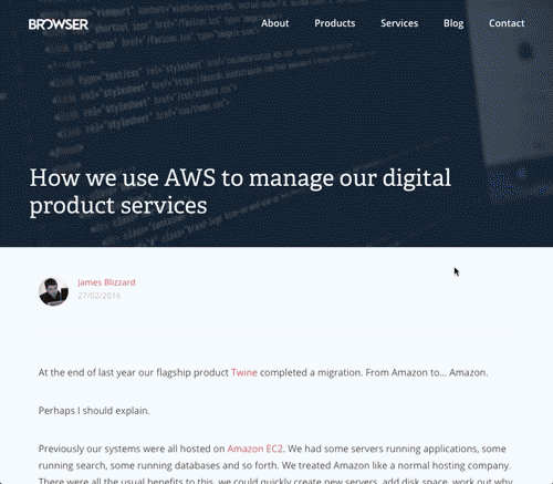
We have used transitions on our blog in the past to illustrate to users that they are navigating between posts
Summary
Like most new technologies and capabilities, transitions were slightly abused when they become available to UI developers – parallax scrolling probably falls into this category – however, I feel when they are used in a considered fashion, they blur the distinction between the web’s perceived “clunkiness” and natives “smoothness”. This way of thinking continues to influence how we develop digital tools and applications for clients, and through user testing, we have discovered that this often-overlooked area of user interface design plays a key part in improving a user’s overall experience online.