Designing Transport Focus

Transport Focus (previously named Passenger Focus) came to Browser with a need to ease their administrative overhead while making the research they produce more accessible and engaging online. This continuous research goes a long way in helping passengers through evidence-based campaigning, but the new website also needed to serve those requiring direct help.
The strategy
To solve these problems we worked alongside Transport Focus to design a website that would be both highly usable and direct in its message.
Together we decided that a mix of interactive and social content would allow passengers to find their answer without putting a strain on phone and email systems. In some cases, through the forum and social media channels, passengers would be able to interact with each other. This would mean less repetition of advice from Transport Focus and less solitude and delays for people with concerns.

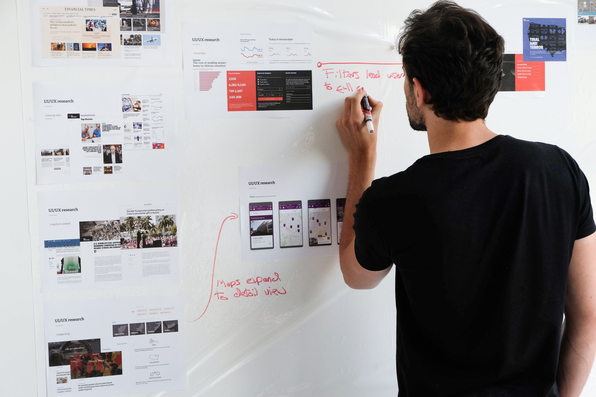
Once our plan was scoped we used wireframing techniques to understand the functionality required to achieve this. At the same time, we looked at how various user interface designs could be presented. From there we studied the content hierarchy of individual pages and sections. This gave us a feel for both the visual design and the experience users would have while navigating the website.
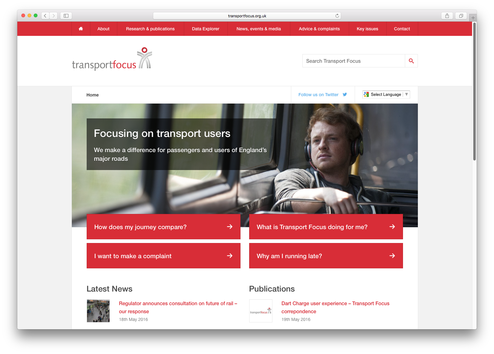
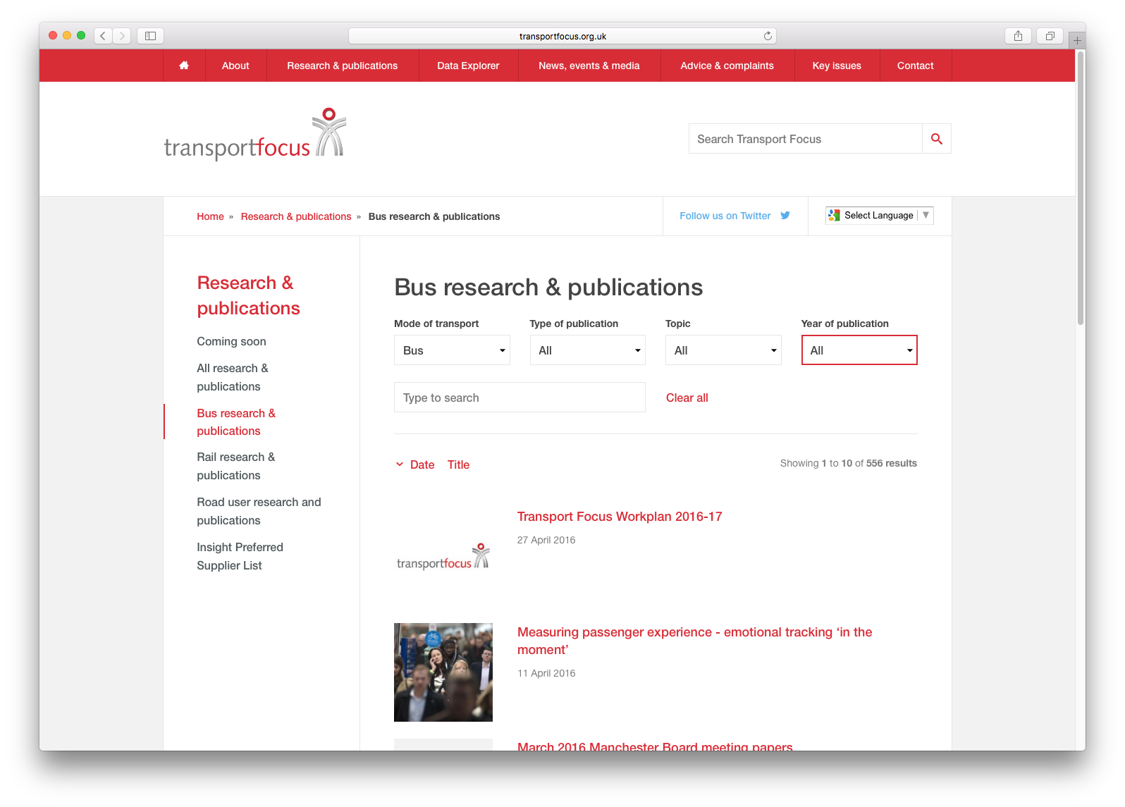
We designed the main landing pages to act as aggregators drawing content from across the website (including research, news, press releases, events, forum posts, tweets, and polls). This worked perfectly to bring the website alive without any additional maintenance. It also allowed us to make use of the rich history of research already produced by Transport Focus. To make the full archive accessible we designed multiple journeys to lead users into the search and filtering pages. We made sure Passenger Focus could retain the ability to promote seasonal research throughout the year. This was particularly important for the annual National Passenger Surveys.
Responsive web design
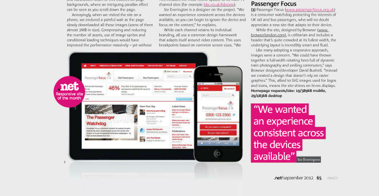
The new Transport Focus website reflects our commitment to future-friendly development. We’ve been watching very closely how new devices like smartphones affect website accessibility. For Passenger Focus we used a “responsive web design” approach, meaning the website shapes itself to fit the device viewing. We see the variety in screen sizes — from 3.5” on a smartphone to 27” on a desktop — as a feature to take advantage of, not a problem to work around. Google has also recognised this shift on the Web and has recently recommended responsive design (over separate “mobile” websites) as it ensures the integrity of content, maintains accessibility, and makes it easier to search.

To make the new Transport Focus website responsive we used the same initial strategy notes to make intelligent design decisions for multiple screen sizes. Examples include prioritising search on mobile, maintaining appropriate text size for legibility at different viewing distances, and promoting call-to-actions when screen space is limited.
Using a responsive design improves user experience and means that Transport Focus need only publish content once to reach their full audience. For a website that serves passengers on trains, buses, coaches and trams across the country, being usable on mobile devices is not just a bonus but a necessity. It’s worth noting too that people are very inclined to access the Web using handheld phones and tablets while relaxing at home. So while responsive design is perfect for Passenger Focus, it’s also a great solution for most websites.
The results
With hard work comes rewards, so we were thrilled when Transport Focus was recently featured in .net magazine’s responsive website gallery, beating out competition from the O Music Awards & BBC TV to be named responsive site of the month.
