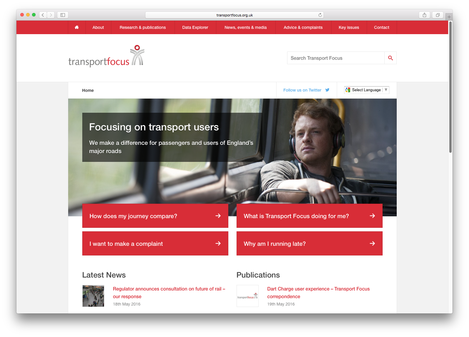
Improving user experience with the UK’s transport watchdog
After expanding to represent the UK’s road users as well as rail, tram and bus passengers, Britain’s independent transport watchdog, Transport Focus, needed to restructure their already content-heavy web presence. We were tasked with improving user experience and web performance to cater for the increased content and usage as the organisation continued to grow.
The project began with requirements gathering and data analysis that was carried out internally by Transport Focus, using this data we facilitated three user experience workshops in which we sought to interpret, analyse and make conclusions. The outcome of this would allow us to make informed decisions and begin designing a system that would improve user experience by heightening engagement, widening discoverability and delivering information quickly and efficiently.
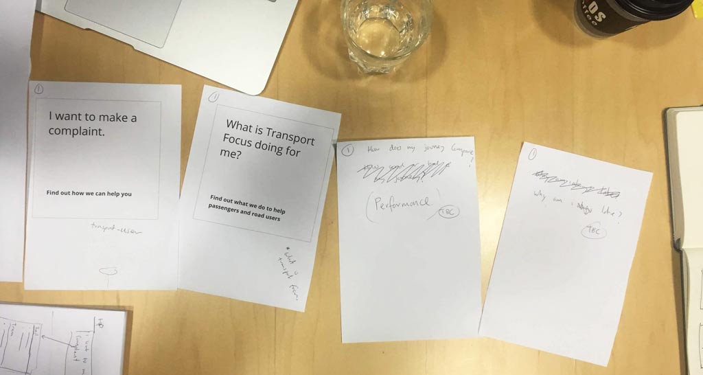
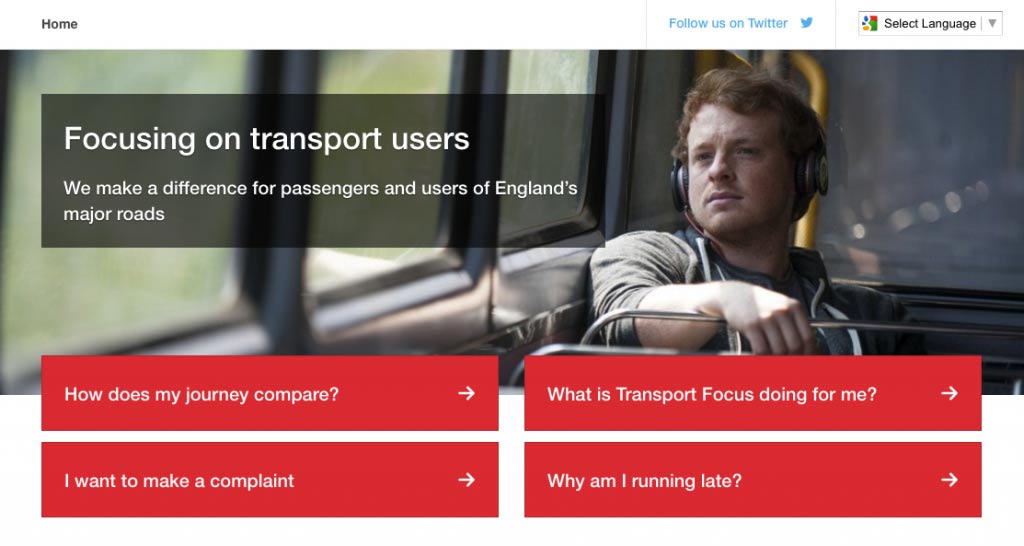
By the third and final user experience workshop, we had concluded there were clear patterns between the data and user behaviour. A large proportion of the existing (and frequently visited) content could be categorised within one of the following three questions:
- How does my journey compare with other transport users?
- What is Transport Focus able to do for me?
- How do I make complaints about the UK transport network?
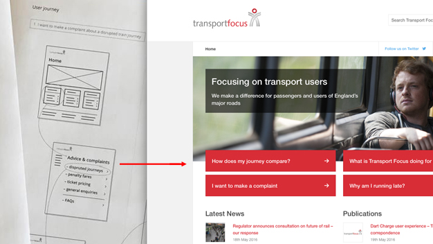
By categorising this content we were able to begin mapping a selection of user journeys that allowed users to navigate, filter and view specific content that would have otherwise proved difficult to find given Transport Focus’ vast library of content – this meant users were able to narrow down and find specific content much quicker – reducing friction and improving user experience.
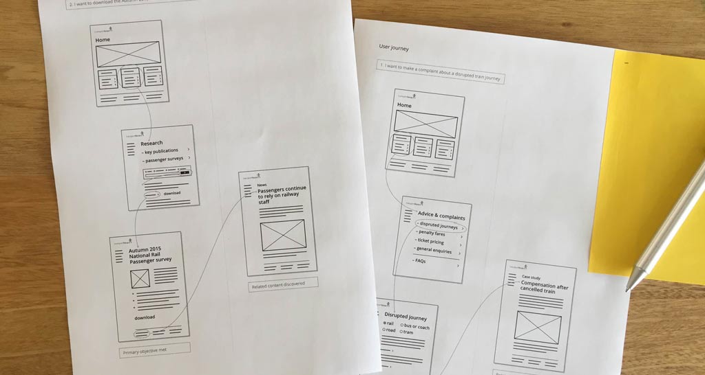
After testing our theory on paper we moved the project on-screen and began developing a prototype using a combination of user interface design and technical development. Moving on-screen allowed us to quickly bring our design to life and allow everyone to see a how the new functionality would perform with dynamic data.
We’re fortunate to have a long-standing relationship with Transport Focus, which meant that the user testing of the product was able to happen frequently, even on a daily basis at times.
Our initial user tests confirmed that our design was working as we had anticipated, so over the following weeks, we continued to design and develop the product, making small iterative changes to elements such as signposting and terminology – this test-and-go approach helped enhance the user experience.
The core elements that helped us achieve the project goal of improving user experience were:
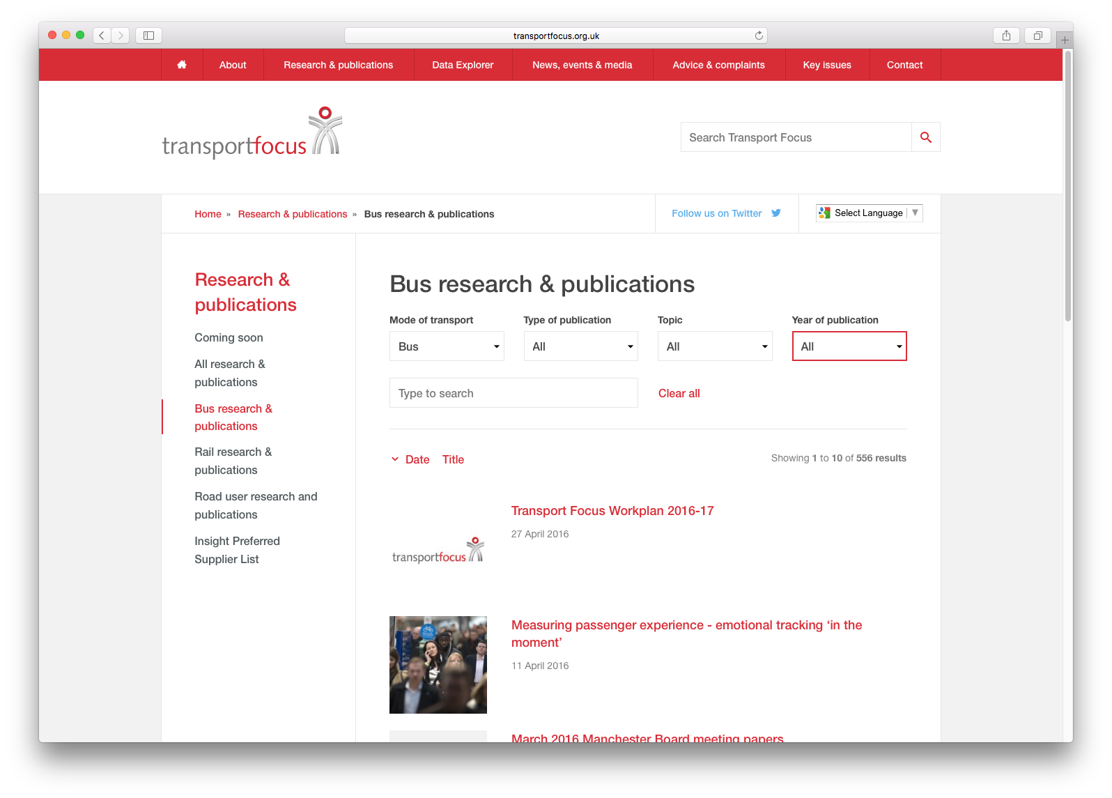
- Using an integrated Google search facility, resulting in quicker, more accurate user searches for the information that they need.
- Re-working the filtering topic search system to offer a more intelligent, speedier reach, using modern AngularJS technology.
- The addition of a related content function now makes suggestions of further connected reading, thus improving and broadening user experience.
- Simple and clear signposting of frequently required information, which enhances user engagement by providing a logical, easy-to-follow narrative, taking users directly to the section most relevant to their needs.
- Content migration was streamlined by Browser for Transport Focus, using an in-house bespoke migration tool to simplify the process.
The redesigned Transport Focus website launched in June and took a total of eight weeks to research, design, and launch.
Sara Nelson, Head of Comms at Transport Focus said:
“Our aim has always been to be useful and make a difference to transport users. Extending our remit to include roads gave us a good opportunity to refresh the website and make it more intuitive for people using it. Once again Browser has helped us deliver a simple, effective set-up that helps people find what they need with ease”
