Design Sprint 2.0: UX design’s new best friend

The hardest part of turning a good idea into an actual digital product or service is getting started. Starting means confronting problems, making compromises and watching as your idea clatters inelegantly into the hard realities of the real world. That process will be challenging whichever way you approach it. But even if it can’t be pain-free, it can at least be quick thanks to Design Sprint 2.0.
So, what is Design Sprint 2.0?
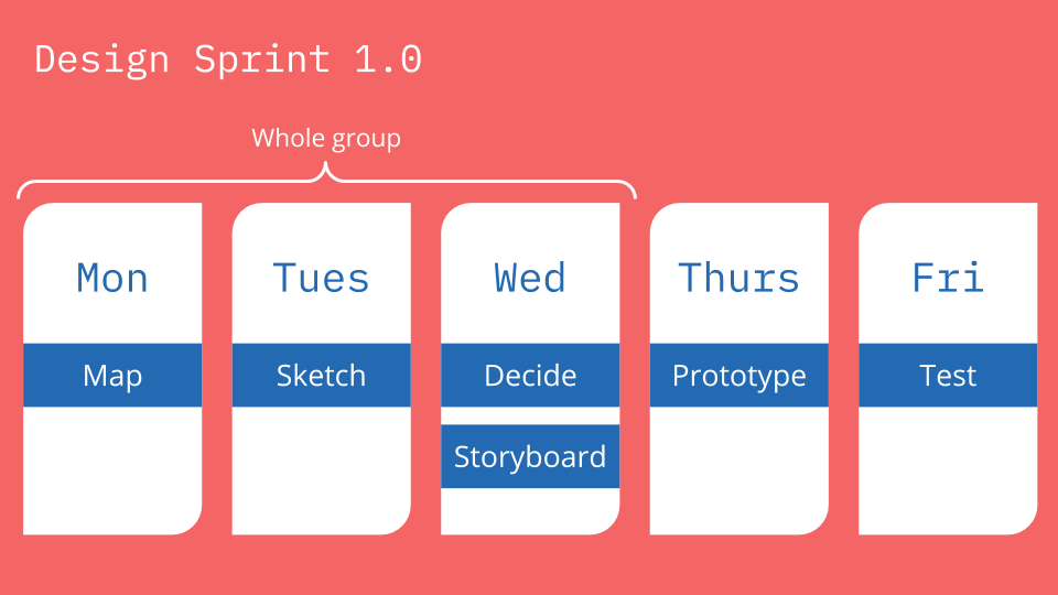
As you may guess, it’s based on the celebrated five-day Design Sprint process that was invented at Google by Jake Knapp and popularised by his bestselling 2016 book Sprint.

The framework aims to assess whether a product or feature is worth developing via a series of rapid prototyping and UX testing workshops. This contrasts with the classic product development cycle, which doesn’t check how customers will react to a product until after launch. Design Sprint validates new ideas fast, before time and money are invested to build them, and it’s a system we’ve used many times with clients.
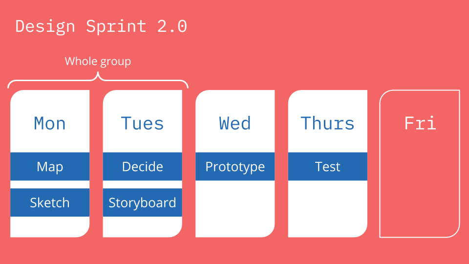
The 2.0 version turbocharges the whole process. The updated framework chops down the classic five-day sprint into an even more condensed, four-day workshop.
Why use Design Sprint over something else?
Good question. There are dozens of user-focused prototyping & problem-solving frameworks out there such as Design Thinking or Jobs to be Done. What makes Design Sprint worth considering?
Well, we like that the highly structured nature of a Design Sprint makes very good use of people’s time, which is essential if you’re asking a bunch of important people to clear their calendars for up to a week. It does this by valuing tangible user experience ideas over discussion. There’s a built-in bias towards getting stuff done, largely because of strict time-boxing. One of the ‘values’ of the Sprint is that getting started is better than being right.
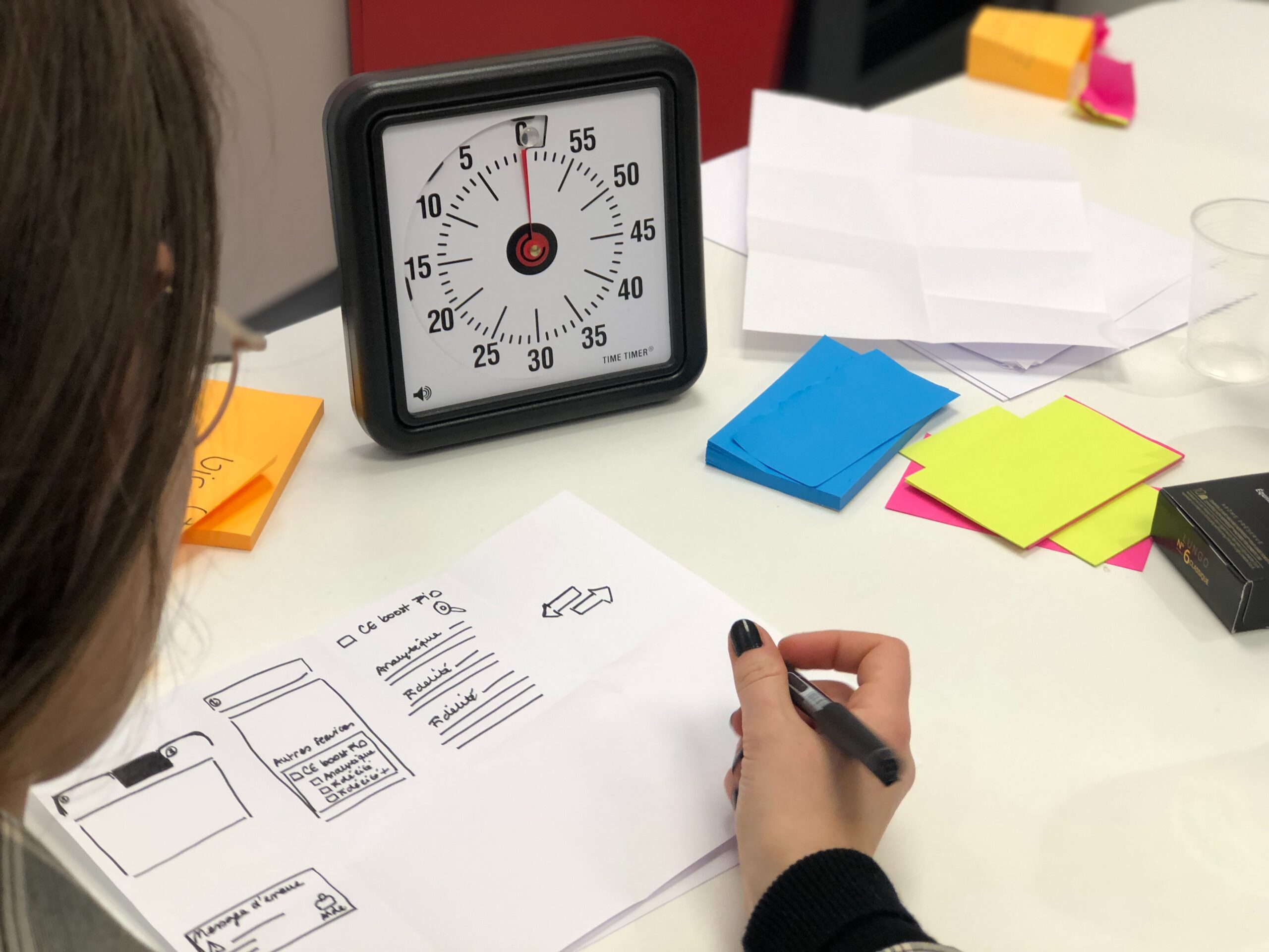
We’ve also found Design Sprint to be a very equalising process. For example, attendees are asked to work ‘together alone’, which puts them in the same space but sets them their own tasks. This mimics a group process but avoids groupthink and reduces the influence of the HiPPO.
In the same vein, another Design Sprint principle is ‘don’t rely on creativity’, which is a round-about way of saying that if done correctly, the process itself should support creativity. You don’t need to rely on your ‘creatives’ to have great ideas. We’ve seen this process tease brilliant ideas out of all kinds of people and personalities.
Design Sprint 2.0 claims to have kept all these great qualities of the original Sprint intact while cutting down how much time the process takes, which sounds like a win-win.
We gave Design Sprint 2.0 a try and here’s what we found
After using Design Sprint for several years with our clients of all shapes and sizes, we took the plunge with testing out Design Sprint 2.0 as part of a wider discovery phase for a search application.
I had my reservations regarding the outcome, could it deliver value in a reduced format? Of course, time is tight in a conventional sprint, so how could 2.0 allow enough time to research, prototype, and validate a product? Would we actually achieve anything of value for the client?
For context, our team for the process consisted of four colleagues (our CTO, two UX designers, and a project manager) and five client participants (three analysts, a product owner, and a senior board member).
What are the advantages?
The first big advantage of 2.0 is simply that it takes less of people’s time. We can’t overstate how big a deal this is. Getting a group of people to commit to clear five full days of their calendar is a big ask, so cutting that figure by 20% is helpful. Not only does this make the session easier to schedule, but it also reduces the overall cost of the process, especially if there are freelancers or contractors involved.
Next, Design Sprint 2.0 is genuinely faster than regular Design Sprint. I had reservations, going in about whether we could stick to the condensed schedule (especially as practised Design Spring 1.0 users) but the framework made it easy. For me, 2.0 is a material improvement over Design Sprint.
In fact, because the time scale is so compressed, it’s hard to think about anything else. Procrastination is driven out of the process. There’s no time for mind-wandering or checking your email over the four-day workshop. Once the design sprint team is shut away together the only thing to do is work towards the end goal.
The team learns fast and fails fast together, and while this was already a feature of Design Sprint, 2.0 takes this process to the next level. This means a minimal wasted budget.
Lastly, we think 2.0 does a good job of rebalancing some of the tasks within the process to make for a more varied and engaging program. For example, the changes to the interview and UX mapping processes of Monday morning make for, in my opinion, a more logical task progression. Similarly, we thought that the individual storyboarding session introduced on Tuesday afternoon made for stronger ideas, compared to the original group exercise.
It’s worth mentioning, too, that Design Sprint 2.0 keeps the intrinsic benefits of the Design Sprint approach intact. It’s still extremely valuable to have a diverse team in one room, working together, building consensus and buy-in through all levels of the business. Even though 2.0 gives the team less time together, we still felt the group developed the empathy and alignment that’s a key outcome of the original framework.
Are there any disadvantages?
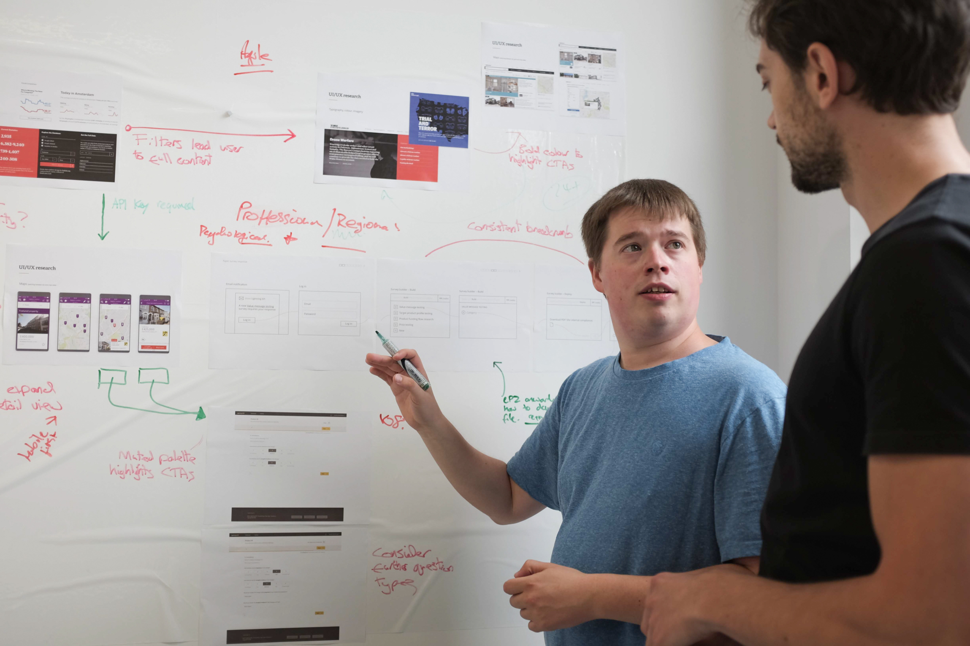
The most obvious disadvantage of Design Sprint 2.0 our team identified was simply how intense and feverish the process is (it’s intense!). The pressure to deliver is sky-high, and the condensed timeframe means things can get scrappy. Think endless post-it notes, debates cut short, prototypes cut and pasted on every available surface…
This doesn’t stop good work from getting done but anticipate that people will be flagging at the end of each day. When we go through a 2.0 process again, we’ll pay more attention to nutrition and hydration. For example, don’t plan a big lunch out. You haven’t got the time and everyone’s productivity will crater in the afternoon if they eat too much, which you can’t afford.
The curtailed timeline also introduces other potential pitfalls. For example, everyone attending must know in advance as much as possible about the problem or product you’ll be looking at. There just isn’t time in the process to get people up to speed. Likewise, the tight time-boxing puts ever more pressure on the facilitator or moderator. It can be tempting to let things run if good work is being done, but you really do need to be disciplined and stick to the programme.
The number of attendees is also something we’ll consider more closely in future exercises. Because of the compressed nature of Design Sprint 2.0, we think it works better with fewer participants than vanilla Design Sprint. Simply put, the more people there are, the more ideas you’ll have to go through, and there becomes a point where you’re really not giving each solution the time it deserves.
Our process involved nine people, and on reflection, this was pushing it. We’d try and have fewer attendees at future workshops. This will mean thinking carefully ahead of time about who attends; the balance between allowing for varied viewpoints but also keeping headcount manageable is a fine one.
Lastly – and this is something that is common to all Design Sprint processes – be aware that this method is purely a UX process. It’ll help you define how to solve your problem, or whether your product is valid, but it won’t tell you anything about the technical underpinnings of your solution. As such, it’s just one part of a wider, discovery phase toolkit.
For example, it’s common to run a technology prototyping sprint alongside a Design Sprint process. This allows for the prototyping of the technical elements required to validate a potential product’s performance. Without this, it can sometimes be tricky to understand if a particular solution is viable or not.
Will it replace the traditional Design Sprint?
In a word, yes.
However, do bear in mind that Design Sprint 2.0 isn’t right for every project. It’s just one tool in a complex toolbox of problem-solving processes.
For example, it works well for projects where the focus is on one core function, such as performing a search, creating an account, or making a purchase. It perhaps won’t work as well if you’re designing a marketing website, say, or a product with a series of equal functionalities. (Though in that scenario, you could break down the functions into individual sprints.)
In my view, its key benefit is that it gets major stakeholders, users, and design teams into one room, allowing valuable decisions to be made rapidly and a consensus to be built.
If you are thinking of running a Design Sprint 2.0 process (which of course, we’d be happy to help you with), do take our suggestions about hydration and nutrition seriously. The task schedule is punishing, so you’ll need every edge you can get to make sure the room is running at full speed. However, If you can ensure this, there are few better ways to create great UX solutions in this kind of time frame.
If you’re still lost then here’s a short 1 min explainer video to give you an overview.