Web site vs web app: What’s the difference and why does it matter?

In the early days of the web, when JavaScript was but a twinkle in Brendan Eich’s eye, the world wide web was strictly a place where you could find web sites. There was no such thing as a ‘native app’ because all applications were native apps; if you wanted complex user interaction, you’d have to explicitly download and run some form of an executable program.
In the world of technology, nothing ever stays pure for very long, and soon the web became home to things that could meaningfully be called applications, be they static HTML pages with server-rendered responses to user input, fully client-side apps written in JavaScript or Flash, or some blend of the two.
On the modern web, you’re free to create and host anything from just a motherf*****g website to a fully-fledged, performant image compression tool. Evergreen browsers facilitate complex experiences with features like GPU-accelerated 3D rendering and audio/video recording. Meanwhile, modern APIs such as service workers and web workers allow developers to negate the web’s traditional limitations (like initial load time and the single-threaded nature of JavaScript) to create websites which feel like apps.
All this begs the question; is it still useful to distinguish between a web site and a web app anymore?
Well, (spoiler alert) I think it is, especially if you’re trying to answer questions about how to create the best UX, or which technology you should be using on a given project.
When does a web site become a web app?
The easiest way to make the distinction might be to say that a website consists of static HTML, perhaps with some light interactivity provided by JavaScript or some HTML form inputs. A web app, on the other hand, would likely be heavier on the interaction, with a lot of functionality provided by client-side JavaScript, server code, or in most cases, both. However, I think this definition is a mistake, as it puts too much emphasis on implementation over intent.
What do I mean by that? Put it this way: I think the more useful model centres on how people intend to use your web app or site, and that this intent should be a key factor driving your implementation. If users intend to simply access information or gain understanding, then you have a site. If they intend to accomplish some task that requires inputs and responses, then you have an app.

It should go without saying that there’s no clear, uncontroversial line between a web app and a web site, whichever definition you use. This user-focused approach doesn’t claim to be the model that will sort most precisely between the two, but I think it is the most helpful model when attempting to develop a successful user experience.
Most importantly, a lot of digital products will, in fact, be a blend of app and site. An obvious example is in e-commerce.
Here, users may arrive with the intention of being informed about your company and its products, but will expect to be able to easily and intuitively accomplish the task of buying something, if and when they get to that stage. This isn’t a weakness of the model, but a strength. It can be helpful to think about the product catalogue as a site, and the checkout as an app, with different but related needs that might necessitate different choices during the design and development process.
What difference does it make?
As a developer, it can be easy to fall into the trap of thinking that there is one right choice of technology or approach for all situations, or one set of best practices for all scenarios. This is something most devs grow out of with experience, but understanding the web app vs web site distinction can help avoid such rigid thinking.
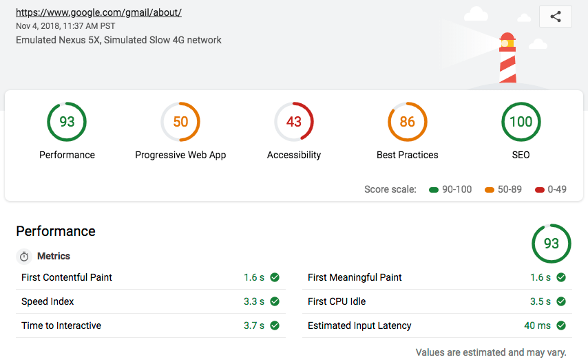
Take initial page load time as an example. I want to emphasize that this is something you should always pay some amount of attention to while developing for the web; excessive load times are never good for your users. But optimizations are always a trade-off. Whether that’s in development time, code complexity and maintainability, or simply in choosing which part of your app to optimize with limited resources.

To go back to the e-commerce example. Let’s say you have the development time and budget to look at reducing load time for either the front page of your store, or your checkout. You know the oft-quoted Google statistics about page load times, but which page do you optimize? Well, if you don’t have the resources or expertise to test the effects of each one (as most don’t), then it can help to think about the part of the journey that is more site-like and the part that is more app-like using the lens of user intent.
When initially hitting your storefront, the users intent is to get information; they are, for the purposes of our model, thinking of your platform as a web site. In this state, they are not expecting complex interaction, are less engaged and so are likely unwilling to put up with any delay.
When the user moves to the checkout, however, they’re actively engaged with the task of buying something. They are expecting to give inputs and responses as part of a more app-like experience, and will probably be more tolerant of short delays.
Again, in an ideal world, you optimize both experiences, but if that’s not possible, having a way to think about where you should allocate your resources is useful.
A parallel example could be a business productivity app where the user might log in once at the beginning of their day, and then complete a given task within the app multiple times during that single day-long session. In this case, it’s probably not too important if there’s some initial load time when opening the app, but if an often-repeated task has one or more long waits built into it, then it can have a serious impact on productivity and user satisfaction.
Tech choices
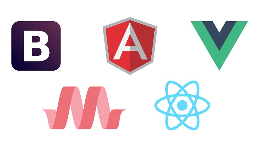
While it certainly shouldn’t be the deciding factor, the site versus app distinction can help you think about technology choices. Front-end frameworks are a good example. It’s no accident that heavy-weight ‘batteries included’ frameworks like Angular and Ember tend to see a lot of their usage in enterprise settings, where the focus is generally on applications. Lighter weight frameworks and ‘UI libraries‘ like React, Vue and Svelte, however, are much more popular when there is at least some emphasis on building a website. It’s also no accident that React was built by Facebook, which is perhaps the ultimate example of a platform that seeks to span the entire site-app spectrum.

None of this is to say that you can’t build a good website with Angular, or that you can’t build a complex application with React, but different technologies have different focuses and strengths that often match up well with different kinds of user. When evaluating which technology to use, try to understand those strengths in the context of your goals, rather than assuming that one is necessarily better than another simply because you used it on your last project, or such and such on Twitter said it was the new hotness.
Usability and UX
Understanding user intent is vital when considering how to ensure users can find what they are looking for and achieve what they want to achieve. Thinking about where your product sits on the app vs site spectrum can help frame your UX goals.
For complex web apps that likely have very proficient and engaged repeat users, it may be worth focussing on adding advanced features, as this could potentially increase productivity for your customers by a significant amount. While nothing in your app should be unnecessarily obtuse, such features might not have as heavy a focus on immediate usability as features that are aimed at less technical or less heavily engaged users.
Depending on your app’s users and their usage patterns, it may be appropriate to provide tutorial functionality or even separate documentation, whereas for a pure web site this would almost never be suitable.
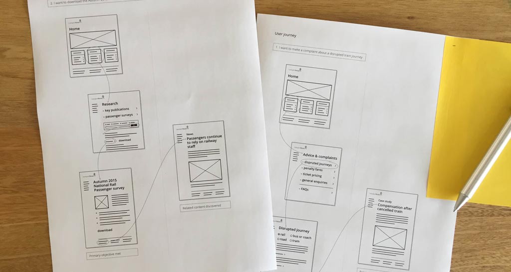
Creating a successful web site UX, on the other hand, is more likely to focus on optimising high-traffic paths through the site. Ensuring that these are clear and intuitive, and that the user is always able to quickly find what they are looking for. Web apps are less likely to have such a focus on specific use cases, largely because their functions are typically more varied.

Conclusion
As always, the key point to understand is that there isn’t any one-size-fits-all approach to development on the web, and considering where your project – or different parts of your project – fit on the spectrum between a web site and a web app can help you avoid getting stuck in an overly specific mode of thinking. With the examples above, we’ve seen that this can apply to many aspects of development, from low-level tech choices to high-level design and UX.
Making this distinction certainly isn’t a panacea that will answer every question you have during a project, but remembering to analyze your users’ intent in this way can be a useful way of finding the right perspective and validating your decisions.