The Influence of Cognitive Load in UX Design, and How to Balance It

In the ever-evolving digital landscape, understanding and balancing the influence of cognitive load could be the secret to propelling your platform’s success, helping to shape that positive user experience which every user desires.
By exploring the way we think and importantly the impact of cognitive load on a user’s experience within a platform, we can uncover strategies to optimise those user experiences and improve engagement by making informed and considered design decisions that will leave a lasting impact.
Understanding Cognitive Load
Cognitive load, as defined in psychology, refers to the mental effort required to acquire new knowledge. It focuses on how individuals acquire, process, and store information within their brains. In the context of UX design, cognitive load can be seen as the mental processing power needed to navigate and utilise a particular feature. When the amount of information exceeds the user’s cognitive capacity, it can negatively impact their overall performance and satisfaction.
Impacting User Experience
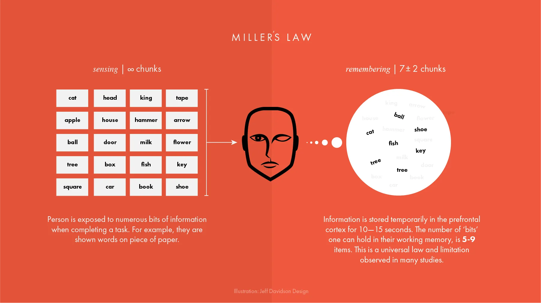
As designers, engineers, and directors, we must recognise the limitations of working memory, for example, Miller’s Law suggests that an average person can hold only seven (plus or minus two) items in their working memory. If we look at Hick’s Law, we note that the time it takes to make a decision increases with the number, and importantly the complexity of choices available.

By understanding this, we can improve the outcome of our design and assist users in minimising cognitive load by prioritising and presenting the most essential information prominently. This approach helps users quickly access the information they seek without overwhelming their cognitive abilities. Sounds simple doesn’t it?

The Dangers of Overload
Although the standard of design across the digital landscape we find today is high, the impacts and dangers of information overload remain prevalent and when users encounter an excessive amount of information, their mental processing capacity diminishes. Take the infamous Lings Cars as an example, while Ling’s website is a borderline parody, it serves as a great example of information overload, it’s this type of overload that can lead to confusion, frustration, and ultimately, the abandonment of tasks.

To ensure a positive user experience, we must strike a delicate balance by carefully designing an intuitive journey that allows the user to achieve their objective with ease. By presenting information in a concise and digestible manner, streamlining navigation, and simplifying complex interactions, we reduce the cognitive burden and empower users to accomplish tasks efficiently.

Optimising your User Experience
Minimising cognitive load requires deliberate design strategies that focus on tactics such as those listed below. When applied together these tactics help UX designers in prioritising essential information and presenting it prominently, enabling users to engage with the platform effortlessly, which in turn maintains traction and retains engagement, collectively it enhances and contributes to a more positive and rewarding journey.
Layout
Keep the design clean and uncluttered, minimise distractions, and use a simple and intuitive layout with a clear hierarchy of information between the elements on each page. Maintain consistency in design elements, such as colours, fonts, and button styles, a consistent design system reduces the mental effort required to adapt to changes.
Navigation
Create a straightforward and well-organised navigation menu, users should be able to easily find their way around the platform without having to think too much. Use colour to visually identify content and navigation and ensure content uses a clear hierarchy. Headings, subheadings (H1, H2, etc), and bullet points can help users quickly scan and understand the content.
Progressive Disclosure
Keep information clear and concise, displaying information progressively as users interact with the content. For example, use “Read more” links to reveal additional content when needed, the more you can keep users engaged and rewarded the more likely they are to engage.
Loading Speed
In 2023 latency and connection speeds are far less of an issue, nevertheless, it’s important to optimise your platform for fast loading times. Slow-loading pages can increase frustration and cognitive load for users, and don’t forget that search engines such as Google will also penalise public-facing platforms for slow load times.
Balancing it to your advantage
Understanding, managing, and balancing the influence of cognitive load is paramount in creating exceptional user experiences, what makes it difficult for UX designers is that there’s a fine balance between just enough design and too much design. However, by acknowledging the limitations of working memory and implementing design strategies, we can ensure that our platforms deliver optimal performance, leaving a lasting impact on our users and their experience.
Reducing cognitive load not only enhances the user experience but also encourages visitors to stay longer, and engage more, allowing them to accomplish their goals with less effort. When users can navigate your platform easily and find the information they need quickly, they are more likely to have a positive experience which will often result in return engagement and importantly the potential for creating advocates of your platform.
Thanks to Christin Hume and Jeff Davidson for their images.