Harnessing UI Complexity for Better UX

Introduction
Let’s start off with understanding one important misconception: User Interface design that asks for multiple steps and interactions is not inherently bad when designing a user experience. Please note this is not an excuse to keep or ignore any existing difficulty within a design. This can include complex navigation, multi-step processes, or even intentional pauses in the user flow. We will be calling this strategic friction. This doesn’t include technical friction, frustrating moments caused by poor loading times, slow data retrieval or other technical issues. Yes, these issues can affect the UX, BUT this article will be focusing on friction caused by design choices. While it may seem counterintuitive, well-executed multi-step UI can serve as a powerful tool for engaging users and creating a more meaningful digital experience.
Understanding the Context

Before diving into identifying and dealing with strategic friction, it’s important to note that friction has context; the digital experience market itself. Educational-based experiences, for example, inherently involve a certain degree of friction as users engage with learning materials and complete assignments. In this case, friction is an essential part of the learning process and contributes to the product’s overall value.
In contrast, an app designed for a task like messaging should prioritise a frictionless experience. Users expect a quick and effortless process, and any unnecessary friction could lead to abandonment and a negative perception of the product.
This also gets more complicated when you look at it by the nature of the industry.
The application of strategic friction varies depending on the target audience and the nature of the product. In B2B (Business-to-Business) products, users often expect a certain level of complexity and there is a learning curve demand of the product. Salesforce isn’t a successful product for any intuitive interface reasons. In this context, friction is going to be a part of the process because of the inherent complexity of the task(s) the user is handling.
On the other hand, B2C (Business-to-Consumer) products typically aim for a more streamlined and intuitive user experience. Consumers have a lower tolerance for friction and expect a seamless journey from start to finish. However, even in B2C products, strategic friction can be employed to create memorable moments, encourage user engagement, and foster a sense of achievement.
Identifying User Friction

If strategic friction is purposely slowing down the user to provide the needed context, user friction is where the design frustrates the user with how slow and cumbersome it is. Here are a few ways to uncover what’s working against and what’s working for a design.
User journey mapping:
Create a detailed map of each step in the user journey, tracking error pages, incomplete journeys, and drop-off points. This helps identify where users are encountering friction and abandoning the process.
Behavioural analytics:
Use software to analyse user behaviour on the website, such as time spent on each screen, hovering over specific fields, rage clicks, and error clicks. This data can reveal where users are struggling to overcome certain hurdles.
A/B testing:
Test different variations of forms, UI elements, and user flows to compare drop-off rates and identify friction points. This allows for data-driven choices when optimising the user experience.
Funnel analysis:
Set up funnels to track the steps users take to complete a desired action, such as making a purchase or creating an account. Analyse drop-off rates at each stage of the funnel to identify where users are encountering friction and abandoning the process.
User surveys and feedback:
Collect qualitative data through surveys, feedback forms, or user interviews to gain insights into user intentions, pain points, and areas of frustration. This complements quantitative data and provides a more comprehensive understanding of user friction.
Are your users getting stuck in your UX or is your UX making people stick around? Book a call to find out.
Story time:
A few years ago, I was on a UX redesign project (where there were plenty of friction points) and the issue wasn’t with the UX friction, it was the issue of being forced to use the platform more.
As the company was expanding, it couldn’t scale its responsive customer service labour with its growing customer base. This led to a big push of using the platform to report problems, issues, communicate, etc to streamline information capture. The solution was a large form that would make a hardened government employee cry. The reduction in quality of the white glove service came as an insult to the established customer base and there was a danger of losing them. The solution was a UX that forced only key friction points with the customer base, with a new UI that only asked what was absolutely needed to gain context & comply with the administrative software.
The moral of the story; some friction points are a result of compromise and can’t be truly resolved without putting additional strain on business operations.
Most Common Friction Points (and how to solve them)
While there are many user friction points that can be dangerous to a product’s health, there are two “usual suspects” that are typically responsible.
Too many steps
Friction in user experience can be beneficial when used strategically, as it helps users develop a deeper connection with the product, potentially reducing churn rates and increasing long-term adoption. However, it’s essential to strike a balance between well-executed friction and user frustration. Overwhelming users with too many steps, especially during critical moments such as onboarding, can lead to a negative experience and hurt product adoption chances.
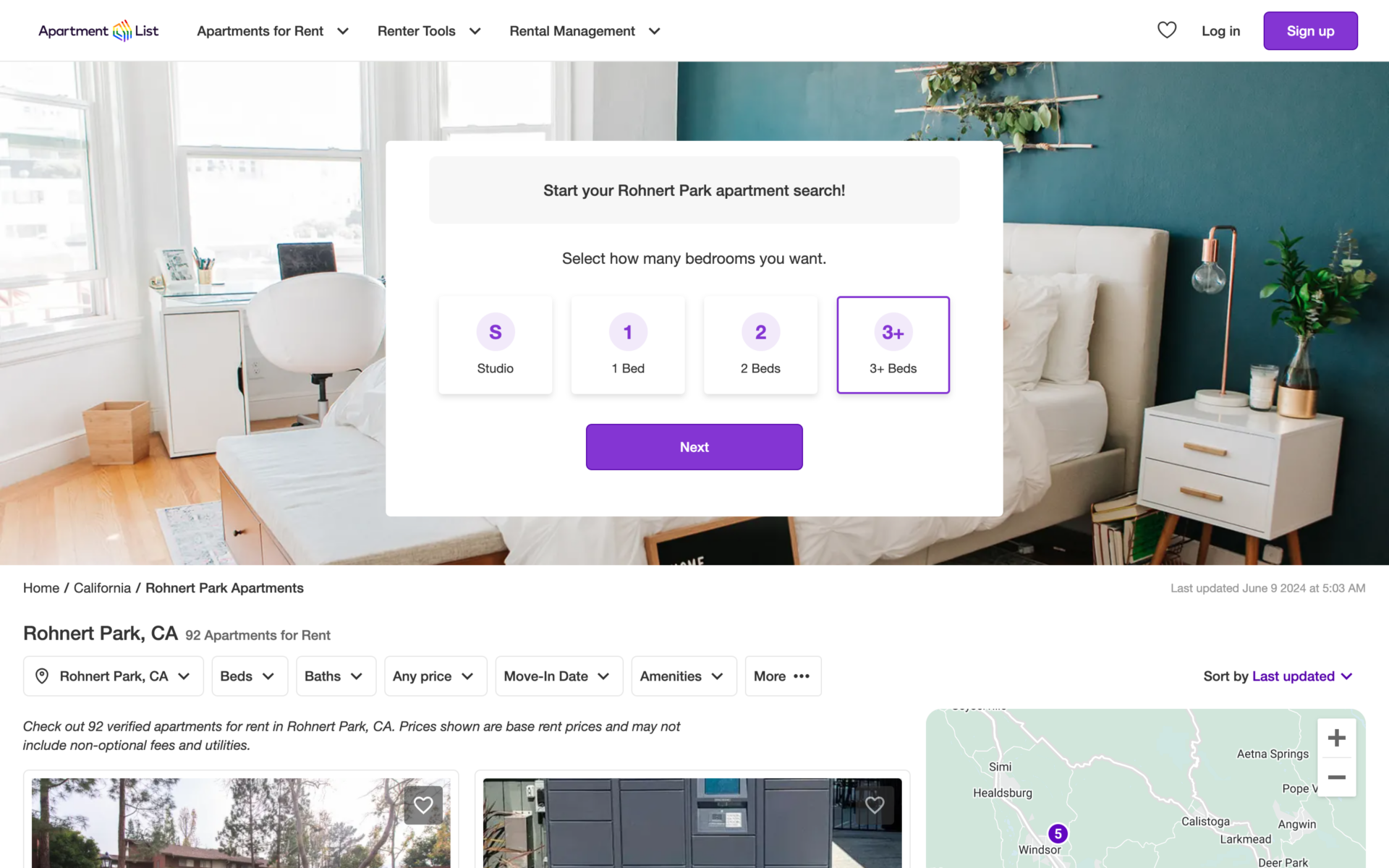
Apartment List could still have a long information capture process for their onboarding if they took the time to explain value of each step.
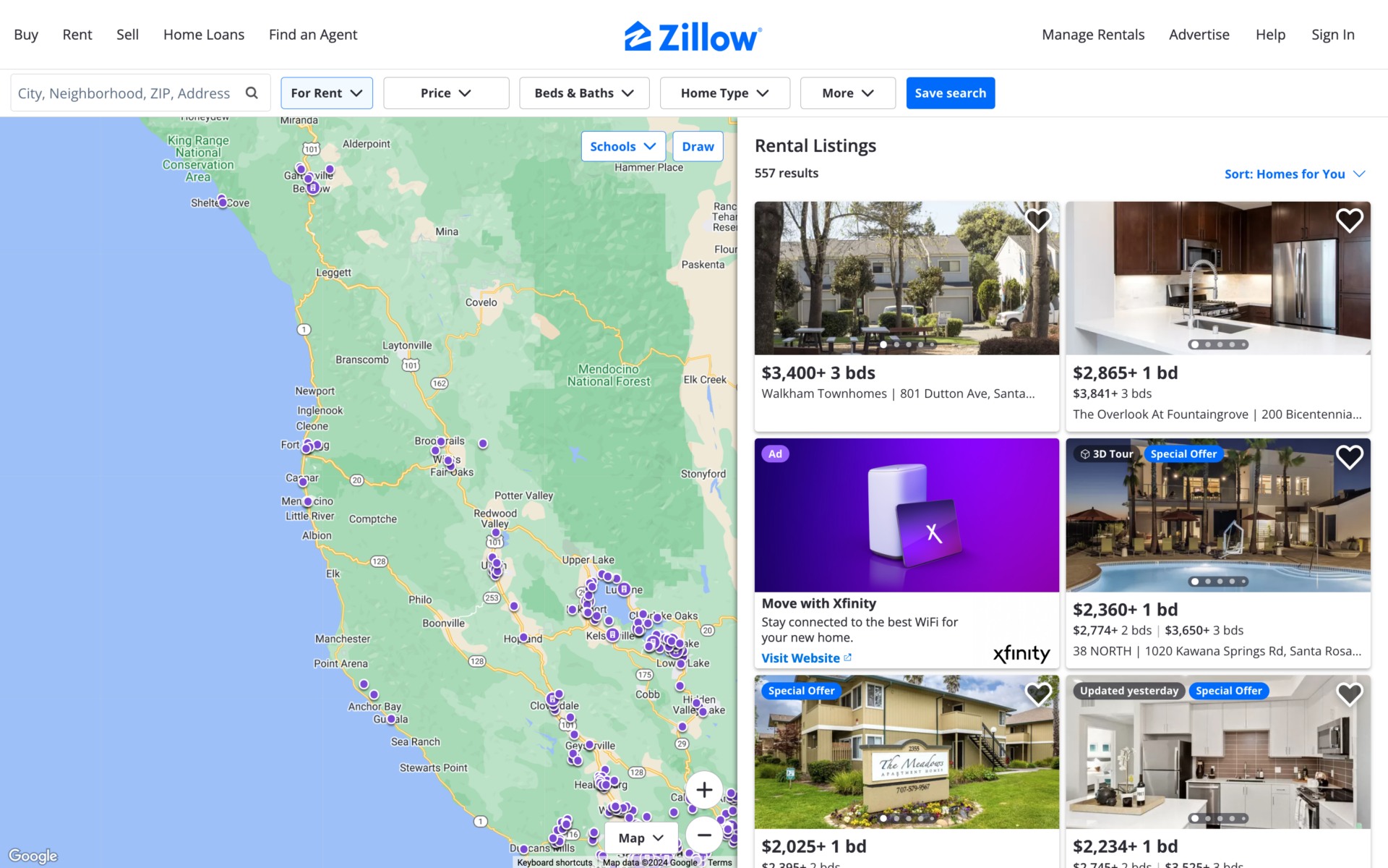
By streamlining the user journey and eliminating unnecessary steps, it can create a more user-friendly experience that encourages users to complete key actions and start using the product effectively. Zillow circumnavigates the information capture phase by having users land on the map, depending on their entry into the experience. The information input phase is responsive as well, each fresh input showing updated results. By striking a balance between information capture and user willingness, designers can create an experience that benefits both the company and the user.
Unattractive, unintuitive, or dated user interface
A study found 70% of users will stop engaging with a website if the layout or content is unattractive. This statistic highlights the importance of creating a visually appealing and intuitive user interface. An outdated or unintuitive design can quickly lead to user frustration and abandonment.
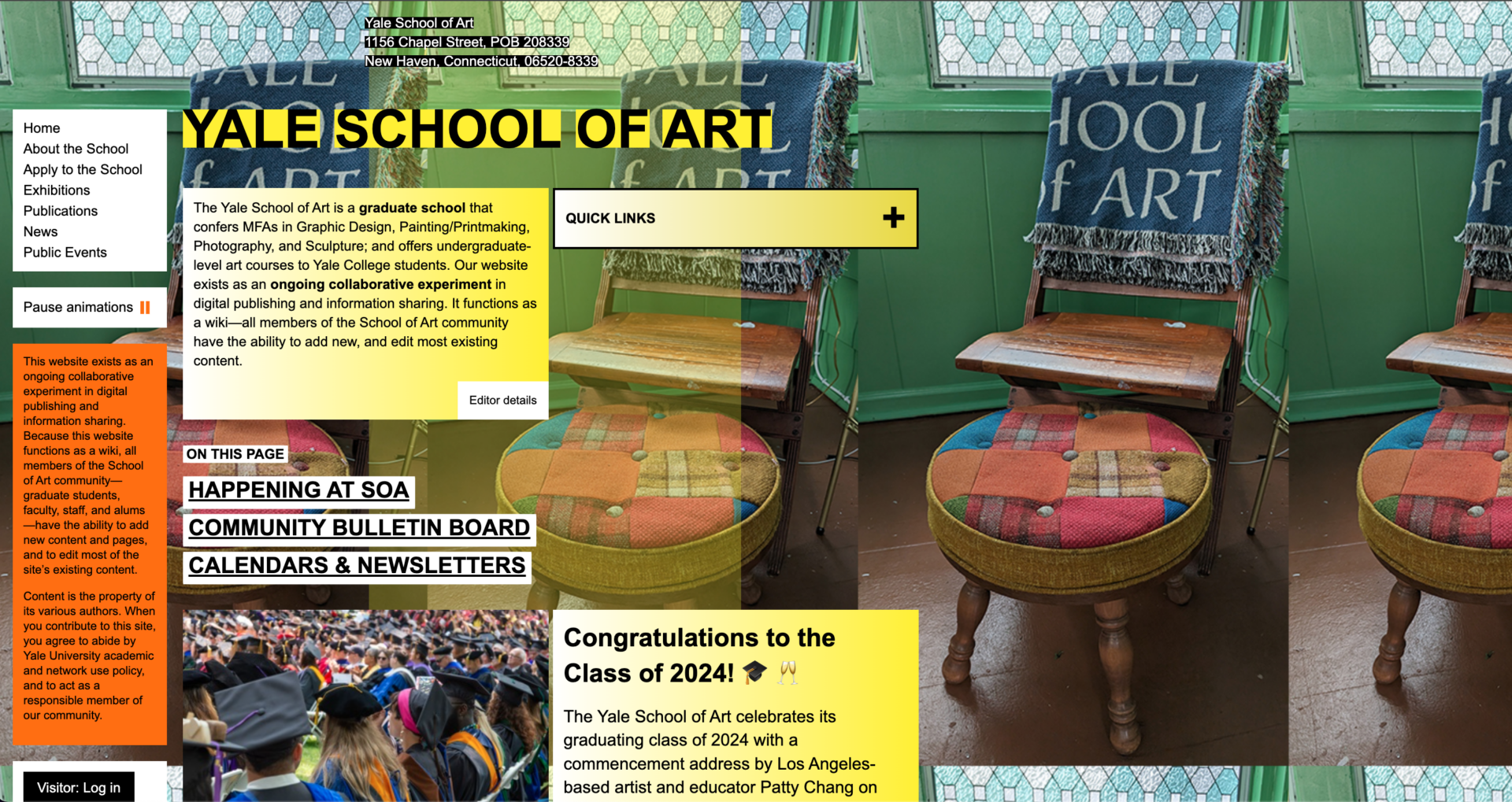
While some institutions, like the Yale School of Art, intentionally break design conventions as an artistic statement, this approach can backfire . Their website, which allows collaborative editing by students and faculty, sparks debate about balancing creativity with functionality. However, for most websites, prioritising user experience is crucial.
To avoid user abandonment, designs should be updated when needed and refined to ensure they remain modern, attractive, establish trust, and are easy to navigate. This typically involves conducting user research, analysing feedback, and iterating on the design based on insights gained. By prioritising the user interface and continuously improving it, designers can create a more enjoyable and engaging experience that encourages users to explore and adopt the product, while still allowing room for creative expression when appropriate to the site’s purpose.
With their work with PreAct Technologies, an AI-enabled smart camera technology company, Browser prioritised user research and iterative design to create an enjoyable and engaging onboarding experience. By conducting user research, analysing feedback, and iterating on the design based on insights gained, the team refined and emphasised crucial touch points within a modernised user experience that blended innovation with simplicity, focusing on creating an intuitive onboarding flow to guide users through the initial setup process and ensure they could quickly start leveraging the dashboard’s powerful features to create tailored intelligent vision solutions.
My final thoughts
By encouraging users to invest time and effort in the product, friction can create a sense of ownership and commitment. However, it’s important to note that friction should not be confused with complexity. The goal is not to make the product more difficult to use but rather to create meaningful touch points that enhance the user’s understanding and appreciation of the product’s value.
Ultimately, the key to successful friction lies in striking the right balance – providing enough resistance to engage users meaningfully without hindering their progress or frustrating their experience.
Thanks to: Pixabay, Maxim Ilyahov, davisuko on Unsplash ❤️.