Strategy-led UX and UI design
Working in a specialist multi-agency collaboration to produce a world class performance platform
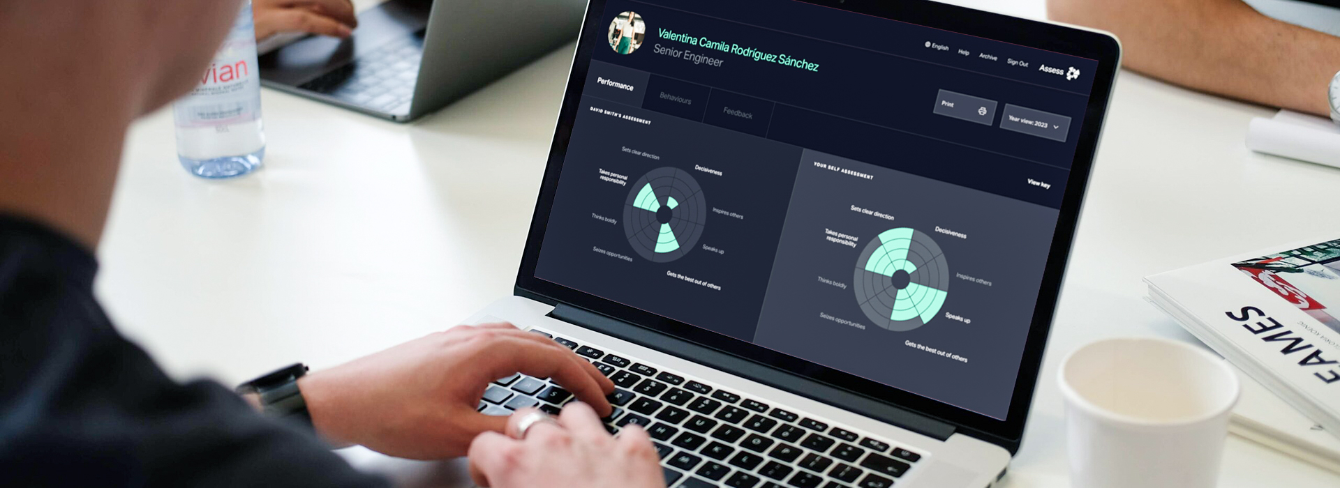
First Quantum Minerals exports millions of tonnes of ore every year, running a complex operation of mines and processing plants spread over 8 different countries.
Complex systems require specialist expertise. First Quantum Minerals’ mines require all sorts of expert roles to keep them moving: equipment operators, engineers, operations people – all slotting together to mine the minerals that the modern world demands.
In this spirit, Browser slotted into a group of specialist agencies to produce a brand new version of First Quantum’s internal performance platform, Assess. Forming a team of three agencies, Browser was responsible for the UX design; making sure that the user experience was as elegant as possible.
The Brief
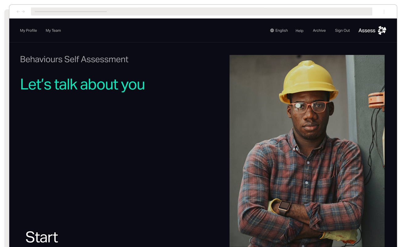
Performance Management was not a new concept to First Quantum: their 20,000 employees had regular touch points with the existing Assess platform where they were given the opportunity to assess their own strengths and weaknesses, plus the performance of those that they manage.
The old system worked, but it had some problems:
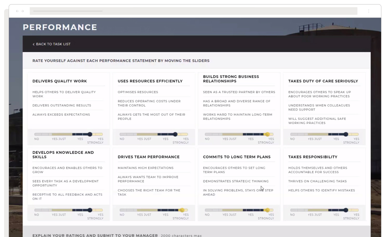
- Staff were asked to rate themselves and others on a sliding scale for each attribute. Inevitably scores would skew to higher numbers since few people were prepared to rate themselves or others as below average.
- The usability of the platform was poor. Designed many years ago, the platform looked and felt like a clunky enterprise application. It didn’t fit the elegant experience that First Quantum aspired to serve to their people.
Browser was enlisted to work within a wider team to create a new version of the platform that would enable staff to assess themselves and others in a way that removed bias and provided the business with an accurate picture of how people were performing and identify those who were excelling.
Working in a team of agencies
Since Assess was a large application that required deep thought at each stage, First Quantum enlisted the services of three distinct agencies to take on each phase of the project. They were:
- Without Studio – Branding and ideation; ensuring a beautiful brand and high-level UI concepts
- Browser – UX and UI execution; responsible for an elegant experience and creating the designs
- Genisys Group – Technical development; translating our designs into working code
Working in tandem with specialist agencies kept our team focused on our primary expertise: creating beautiful experiences and interfaces, whilst the other agencies took charge of their own jobs.
Creating a rating mechanic to remove bias
A major challenge of the new platform was producing a mechanism to complete assessments without encouraging bias, as was found in the previous system.
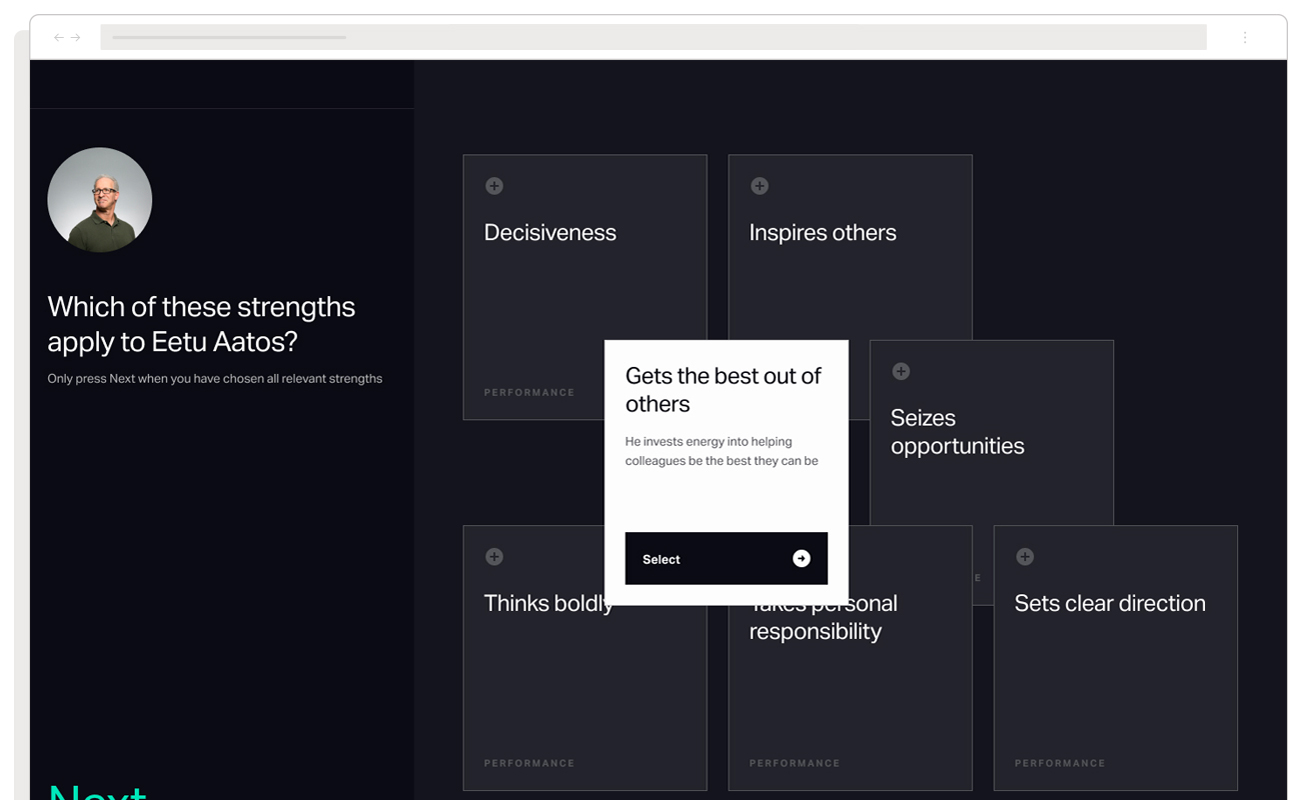
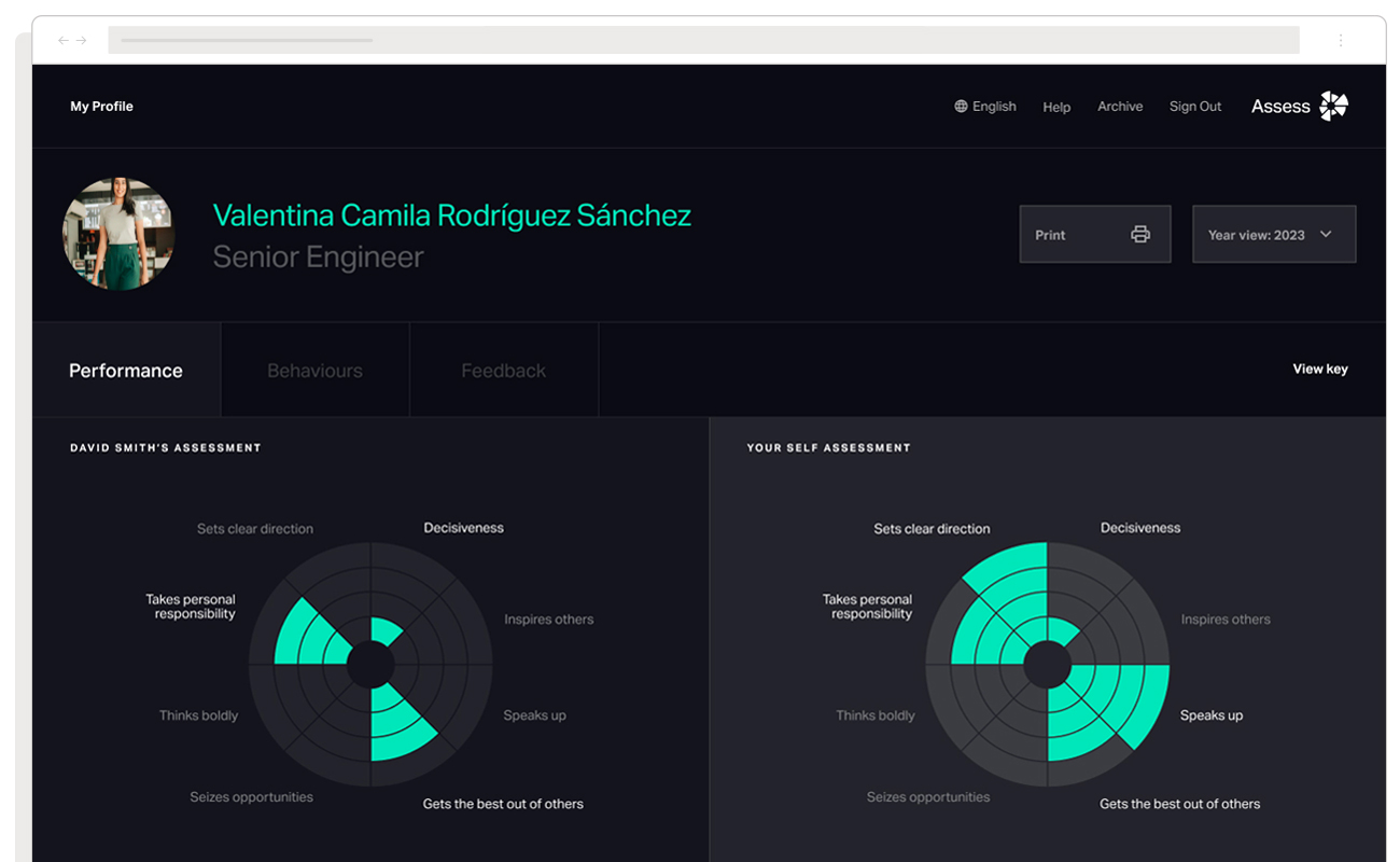
After exploring a range of creative options and testing them, a ‘cards-based’ design came out on top. Displaying eight cards to the users that displayed First Quantum’s key strengths, users were able to select those which they thought applied and leave those that didn’t. For selected strengths, follow-up questions were shown in order to understand the context around their choice.
Steering away from a rating scale and towards a more considered approach encouraged users to think critically about how and when they demonstrated a strength.
Creating production-ready designs
The user experience had to not only look but feel beautiful. Directed by Without Studio, the Assess brand was serious and engaging, yet warm and human at the same time. This is a business platform but should feel as elegant and sleek as anything on your phone.
Our task was translating this brand into a working interface. Using Figma, our design team created high-fidelity, interactive prototypes that demonstrated all the animations and transitions required in the application. Executed to a level whereby using them felt like using the application for real, these prototypes were used to present to stakeholders within First Quantum and handed over to the development team Genisys Group who was in charge of building the platform.
The outcome
The first year using the new system saw an uptick in engagement and positive user feedback. The responses collected were also much more useful for the business – assessments expressed a broader range of strengths thanks to the new rating mechanism.
The platform created for First Quantum is yet another touch point we helped transform that leaves employees feeling like they work at a company that values them by developing fantastic employee experiences.