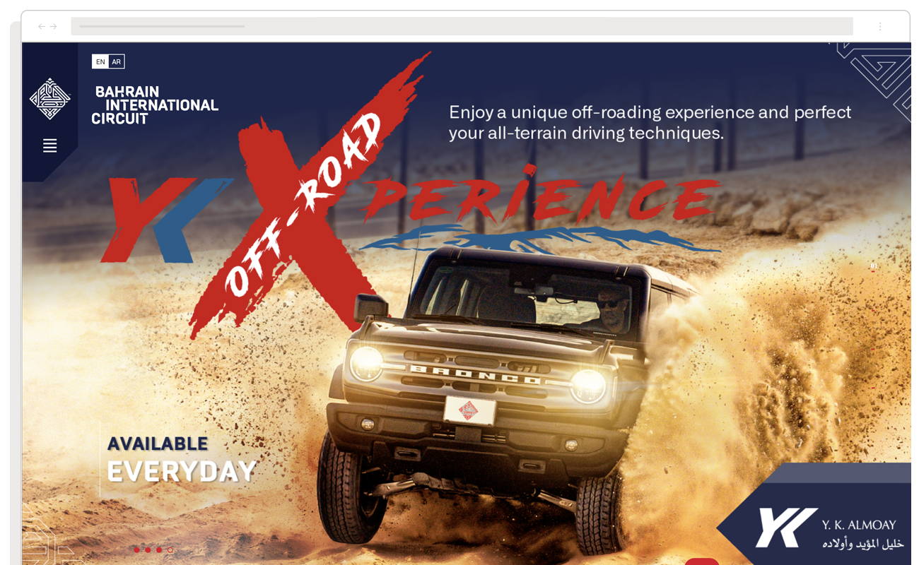
Website design and development
A brand new user experience that improved conversion rates and dramatically increased international ticket sales
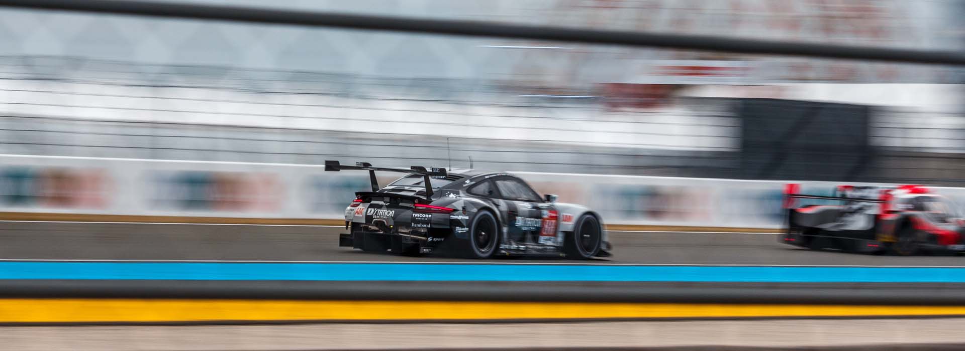
As the host circuit for the opening race of the season, the Bahrain International Circuit is a prominent fixture on the Formula One calendar. With a grandstand capacity of 70,000, spectators travel from across the globe to enjoy the race action, the iconic illuminated desert surroundings and the state-of-the-art facilities.
In addition to hosting the Formula One Bahrain Grand Prix, the circuit accommodates other motorsport events such as the FIA World Endurance Championship and the Bahrain GT Festival, attracting motorsport enthusiasts from around the world.
Bahrain International Circuit challenged us to create a new user experience that would complement the digital marketing strategy and dramatically increase international ticket sales for these world-famous events.
The Brief
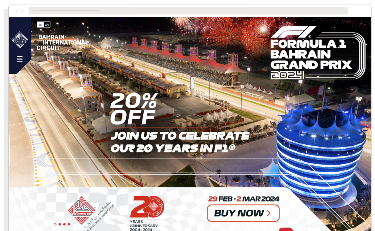
The team at Bahrain International Circuit were particularly interested in boosting conversions for the lesser-known racing events such as the FIA World Endurance Championships, Formula 2 and 3, plus experience days and hospitality events, particularly with international customers.
In order to achieve this, the new experience would need to complement the digital marketing strategy by delivering the endpoint for the e-commerce transaction, whilst also remaining as captivating as possible by blending well-defined messaging for each event, vivid race day imagery and a smooth user journey that promotes all of the events, but stays elegant.
Starting with the value proposition
In order to convert site visitors into paying customers, we needed to be crystal clear on what value the website was offering. This is where our Value Proposition Workshop came in.
Here we worked with the Bahrain International Circuit team to understand who their customers are, what pains, gains and jobs they have, and what we can offer them to match this. This forms the basis of our value proposition and is essential in distilling down the messaging and design into something that is hyper-focused and relevant to customers.
The value proposition sets the tone for everything that follows: content hierarchy, brand and imagery and the user experience. It also sets the pace for the wider business and marketing strategy, ensuring that the website is consistent across all channels promoting the events.
Mapping user journeys
When it comes to an event-based eCommerce website, it’s absolutely essential that users can easily locate two crucial elements:
A) Detailed information about the events
B) A seamless way to purchase tickets
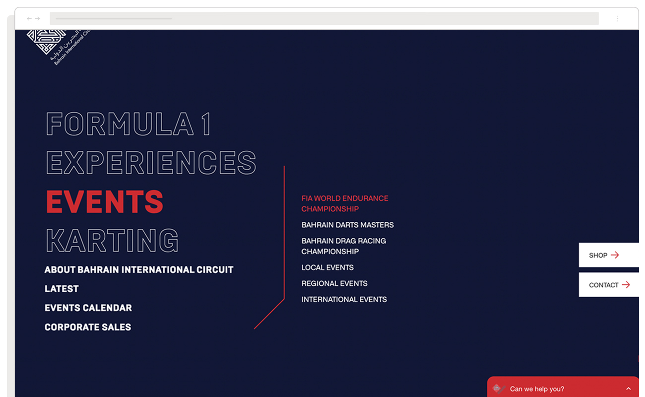
Bearing in mind our aim to increase conversions, it was vital that each user journey was carefully balanced to give prominence to informational content about each event (location, dates, price etc.), whilst retaining the abundance of exciting race content that was available (race videos, driver interviews, course walkthroughs). Getting this balance wrong could lead to a website that is far too functional, missing out on the excitement of race day, or a site that is difficult to achieve functional tasks like quickly finding out information about events.
In order to ensure that we had this balance correct and had created a user experience that results in a conversion, we rapidly prototyped our user journeys with real content that could be quickly tested using the crowdsourced test suite usertesting.com.
Working quickly and killing ideas that were shown not to work, over a period of three weeks we went from untested designs to a concept that we had high confidence would be usable, exciting and convert customers. All that was left was to flesh it out.
Building the design system
The luxury of working with a Formula 1 circuit is the amount of incredible content that can be showcased on the site. Multicoloured blurs screeching through corners, glinting spoilers under the spotlights, champagne spraying over jubilant crowds.
This provided an array of captivating colour profiles for the design system, as well as high-quality photography and video. We used Figma to bring this all together into a brand design language that retained the rush of race day, but provided enough order to produce a coherent design system.
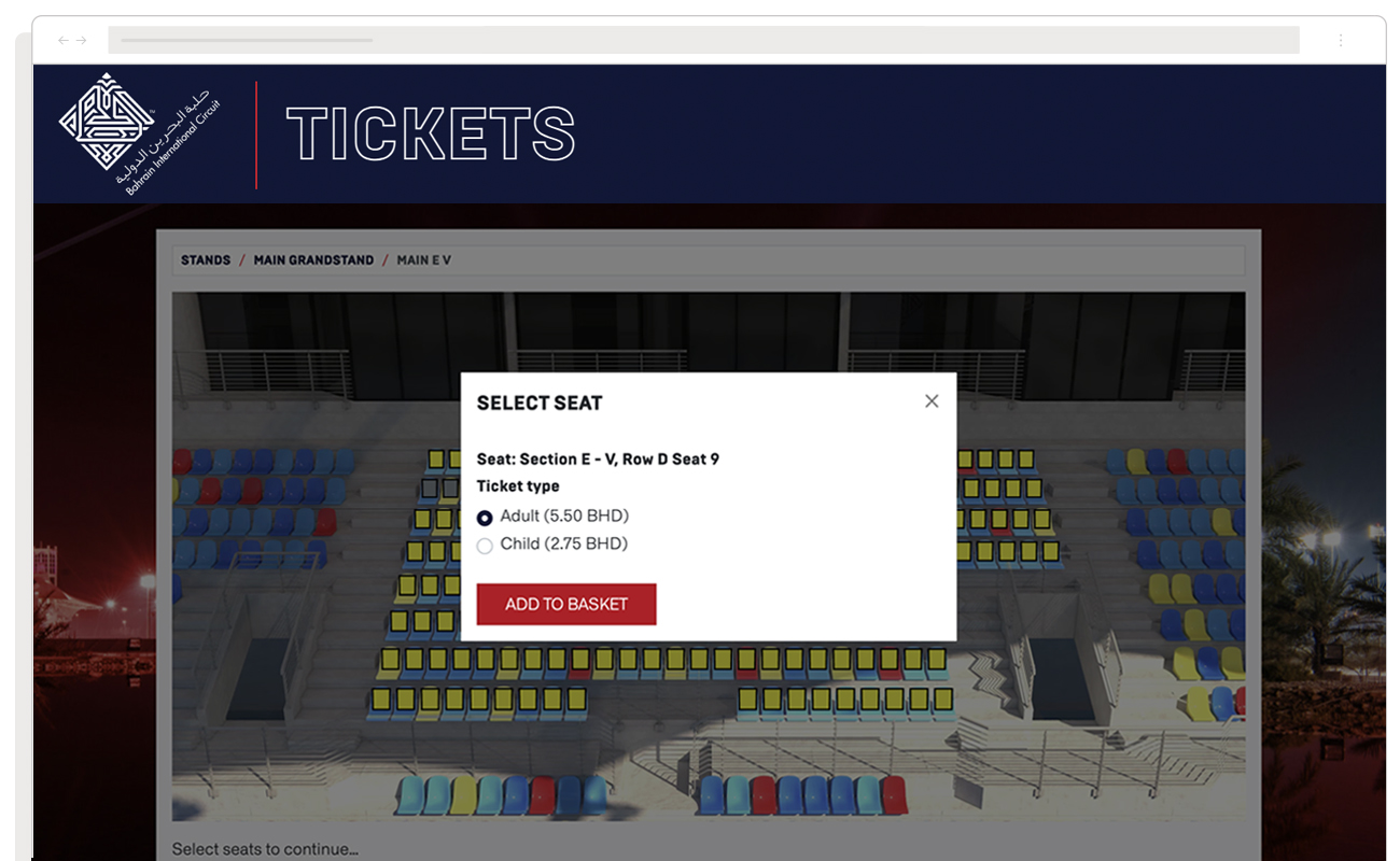
These elements were then carefully crafted on reusable components that would assist users in navigating effortlessly around the site, getting a feel for the events available and ultimately completing a purchase.
The outcome
With the new site up and running, Bahrain International Circuit saw exactly the kind of uptick they were looking for, particularly in their non-F1 events. In the first 6 months, we saw:
- 43% increase in conversions for the Formula 1 main event
- Average 91% increase in conversions in other events
This was the final validation that we needed to know that the new design would achieve its goal over the long term. Yet it wasn’t entirely a surprise; the hard work done in the design process gave us the confidence that the new website would convert significantly better.
But that’s not the chequered flag. In the spirit of iterative development, we’ll continue to look closely at the data to understand how we can improve the site to increase international ticket sales in next year’s events. Watch this space.
