Strategy-led UX and UI design
Updating a complex data dashboard’s UX and UI to enhance platform performance and drive growth

An expanding business
Our client is a leader in the healthcare software space, providing data dashboards and compliance tools for hospitals and healthcare organisations. While their platform was functionally strong and well-liked by users, it needed an update across the user experience and interface design, especially as they continued to expand into the North American market.
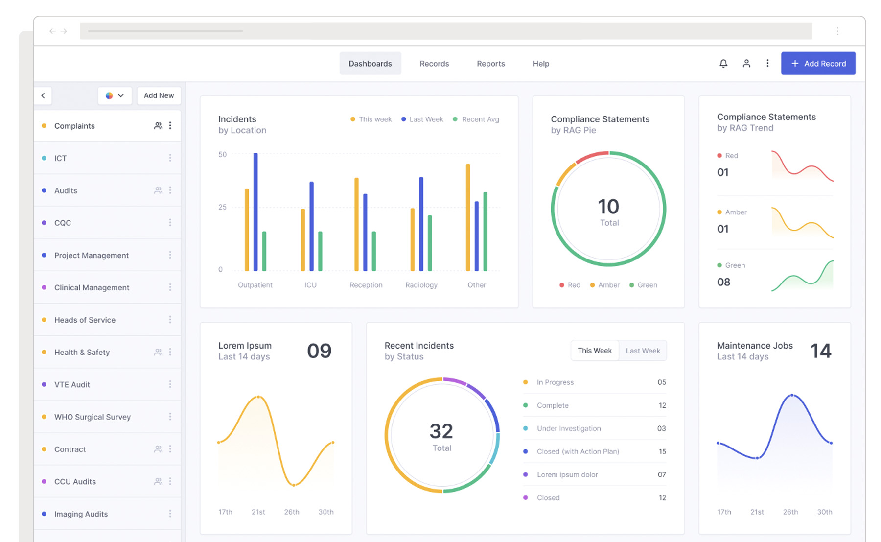
Compliance officers and administrators required more powerful and flexible tools for generating reports on incidents and outcomes, as the existing reporting capabilities were difficult to use and often required manual workarounds, making it challenging to derive actionable insights in a timely manner.
The goals were to provide an intuitive, user-friendly interface for building custom reports, allow for easy saving and reuse of common report templates, enable more granular filtering and segmentation of incident data, and improve the visual presentation of reports for easier interpretation and sharing. Plus, explore integrating generative AI capabilities to help users quickly access the data they need.
User research & analysis
The redesign process began with a comprehensive user research phase, spanning five weeks and involving a series of interviews with carefully selected participants. These interviews provided valuable insights into users’ roles, workflows, pain points, and requirements. In parallel, the team conducted a thorough audit of the existing platform, assessing its strengths and weaknesses from a UX perspective. This two-pronged approach allowed for a holistic understanding of the platform’s performance and areas for improvement. The findings from the user interviews and platform audit were synthesised into a detailed analysis and recommendations report, which was presented to the senior leadership team on a weekly basis.
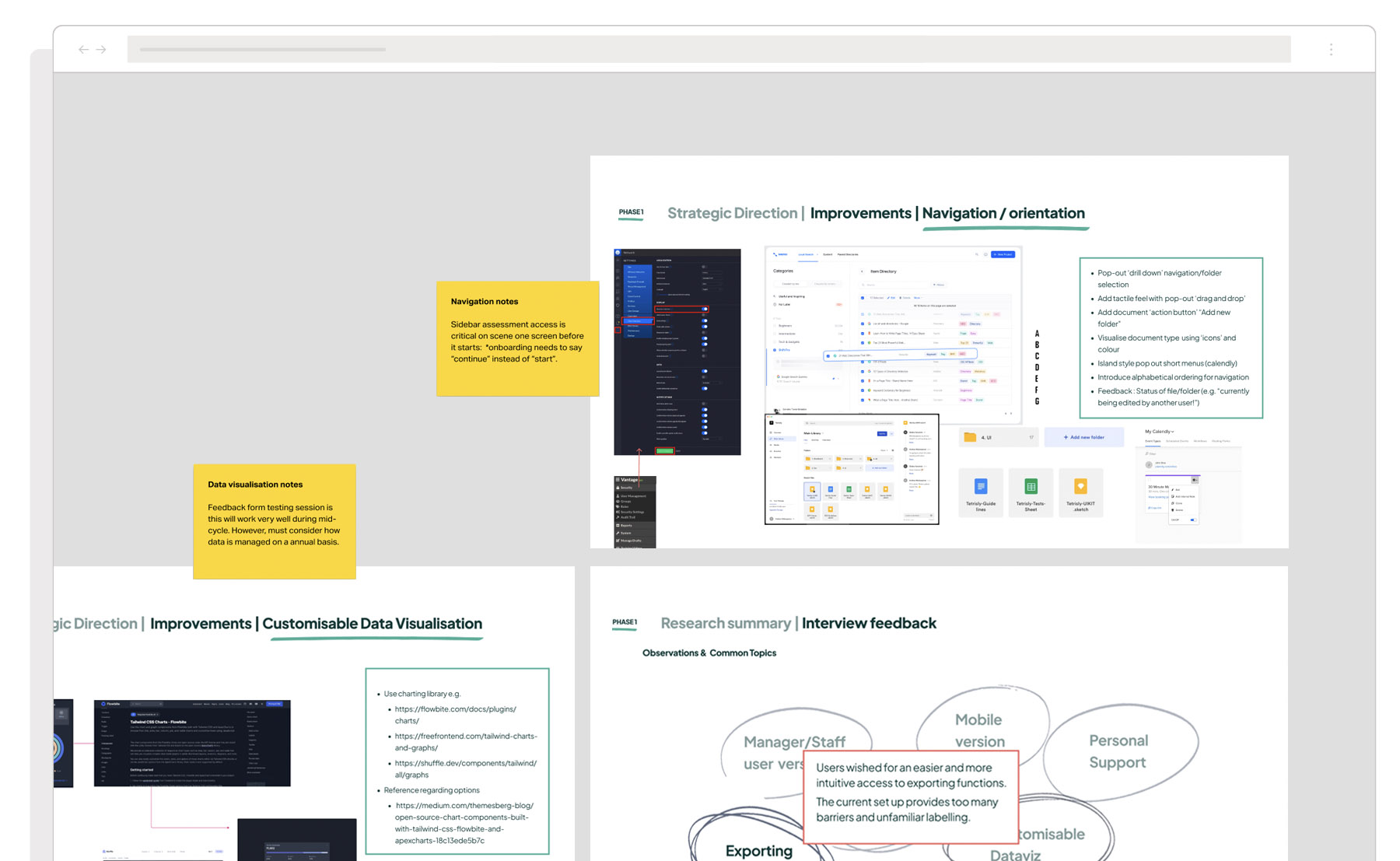
The re-designed UX
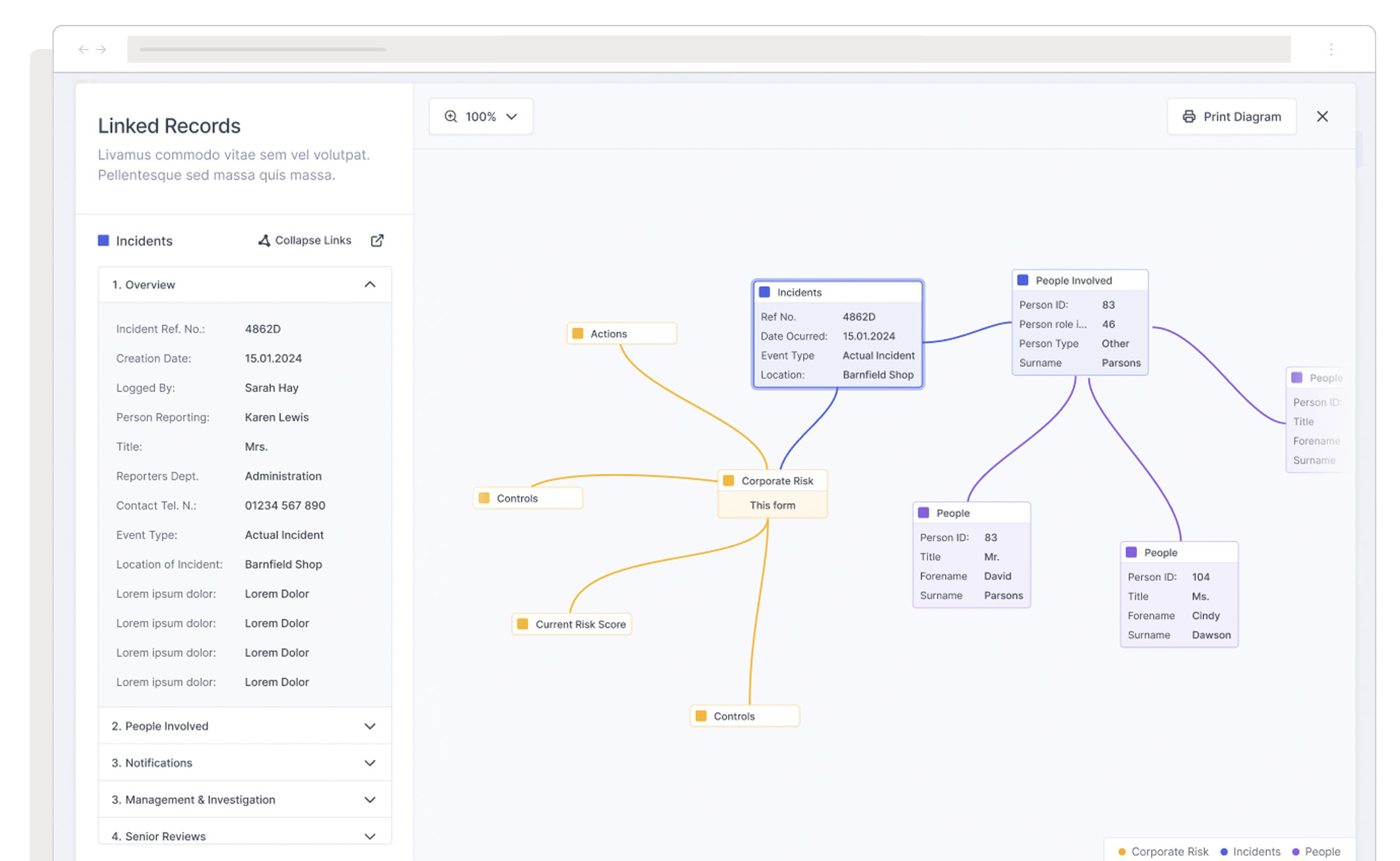
The redesigned UX leverages the interconnectivity of the platform, and emphasises helping users navigate vast amounts of data quickly. By prioritising critical data points and frequently used tasks based on each user’s role, the new design was reinforced by a stronger information architecture. This user-centric approach to information architecture empowers healthcare professionals to make data-informed decisions more efficiently, ultimately leading to better patient outcomes and improved overall performance.
Testing it with the users
Wireframe testing was a cornerstone of the strategic UX process, quickly learning and applying those lessons to the next series of designs.
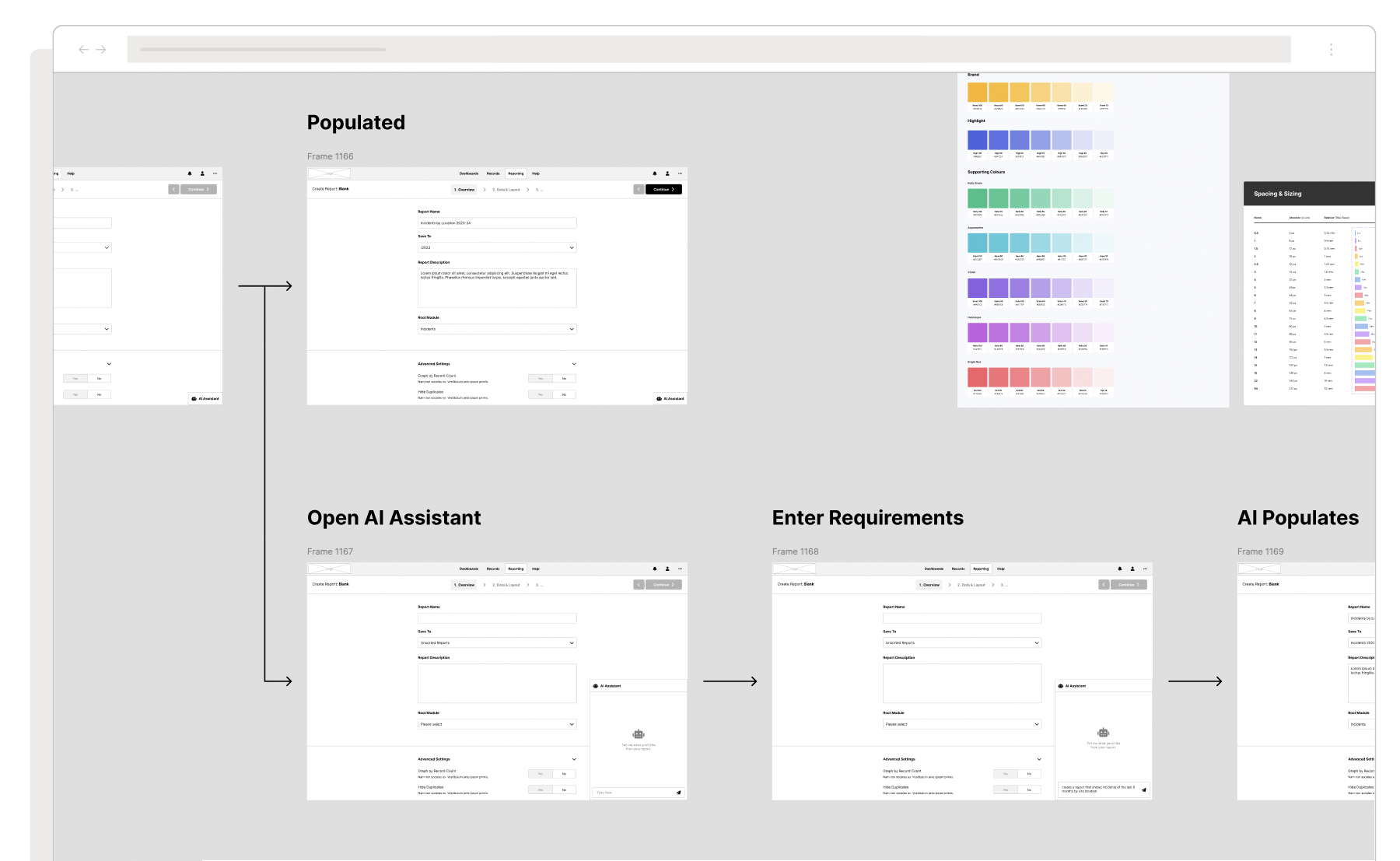
The wireframe testing helped highlight pain points and informed the iterative UI design and development process. By involving users at each stage, we were able to identify areas of friction early on and make targeted improvements. For example, user feedback revealed that the initial incident reporting flow was still too complex, prompting further simplification in subsequent iterations. This continuous loop of user input and refinement ensured that the final designs were closely aligned with user needs and expectations. We made several rounds of refinements based on user feedback before moving into higher-fidelity prototyping.
This continuous user testing and feedback loop revealed three key user experiences;
Developing the dashboard
The redesigned dashboard offers a personalised, intuitive experience that prioritises relevant data and tasks based on user roles. It features a visually appealing interface, easy customisation options, and clear data relationships, empowering users to create their own dashboards tailored to their needs.
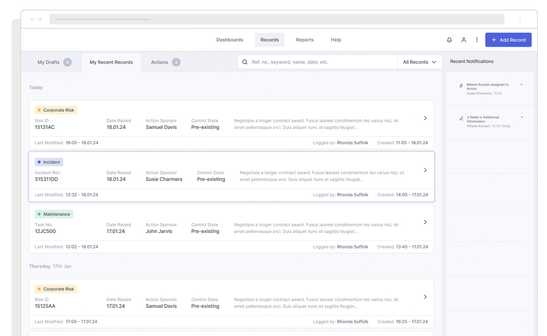
Reporting Incidents
The overhauled incident reporting workflow simplifies the process for nurses, minimising manual data entry through autofill and smart suggestions. The redesigned interface streamlines communication for incidents involving multiple parties, ensures data accuracy and completeness, and allows nurses to spend more time on patient care.
Generating reports
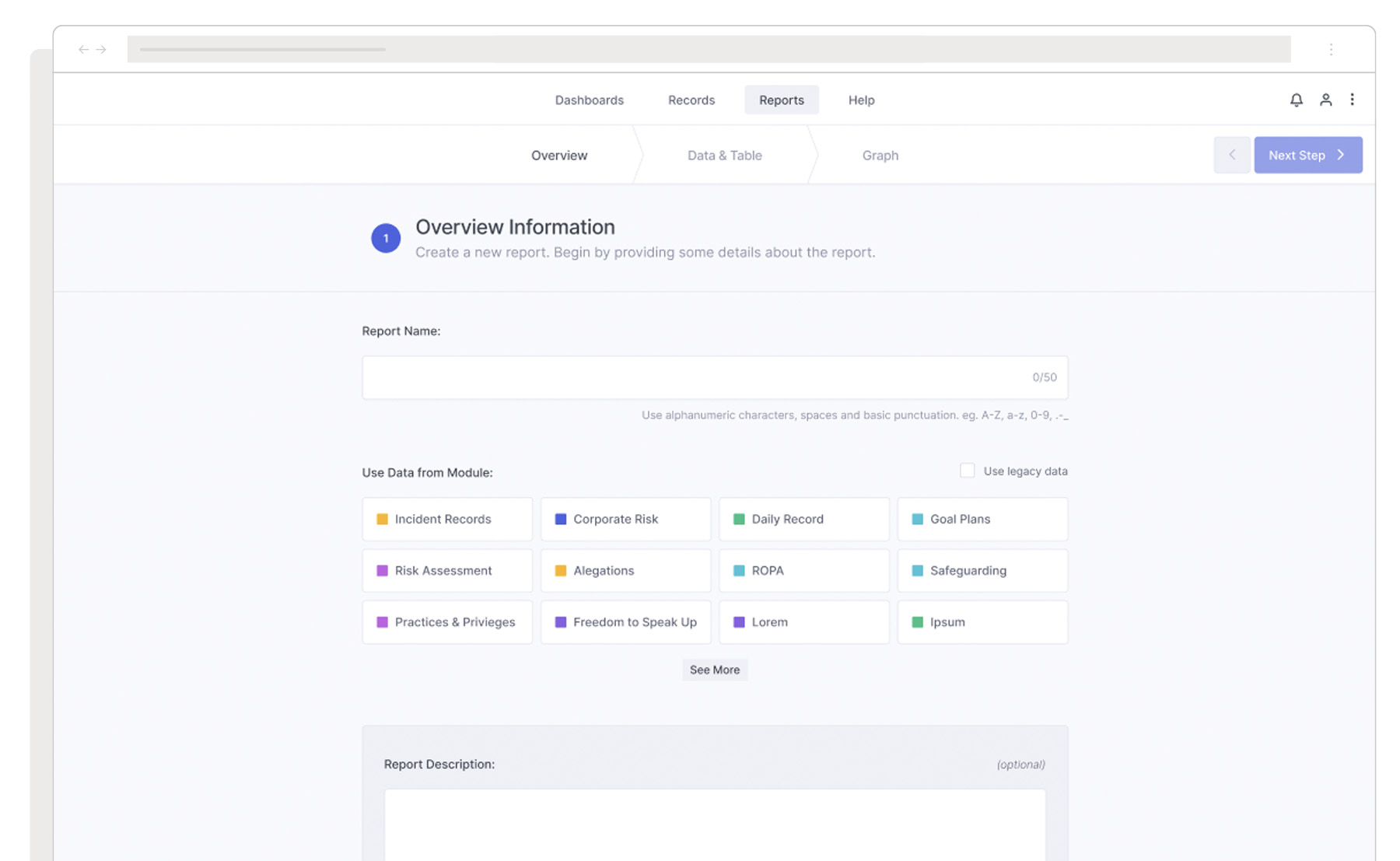
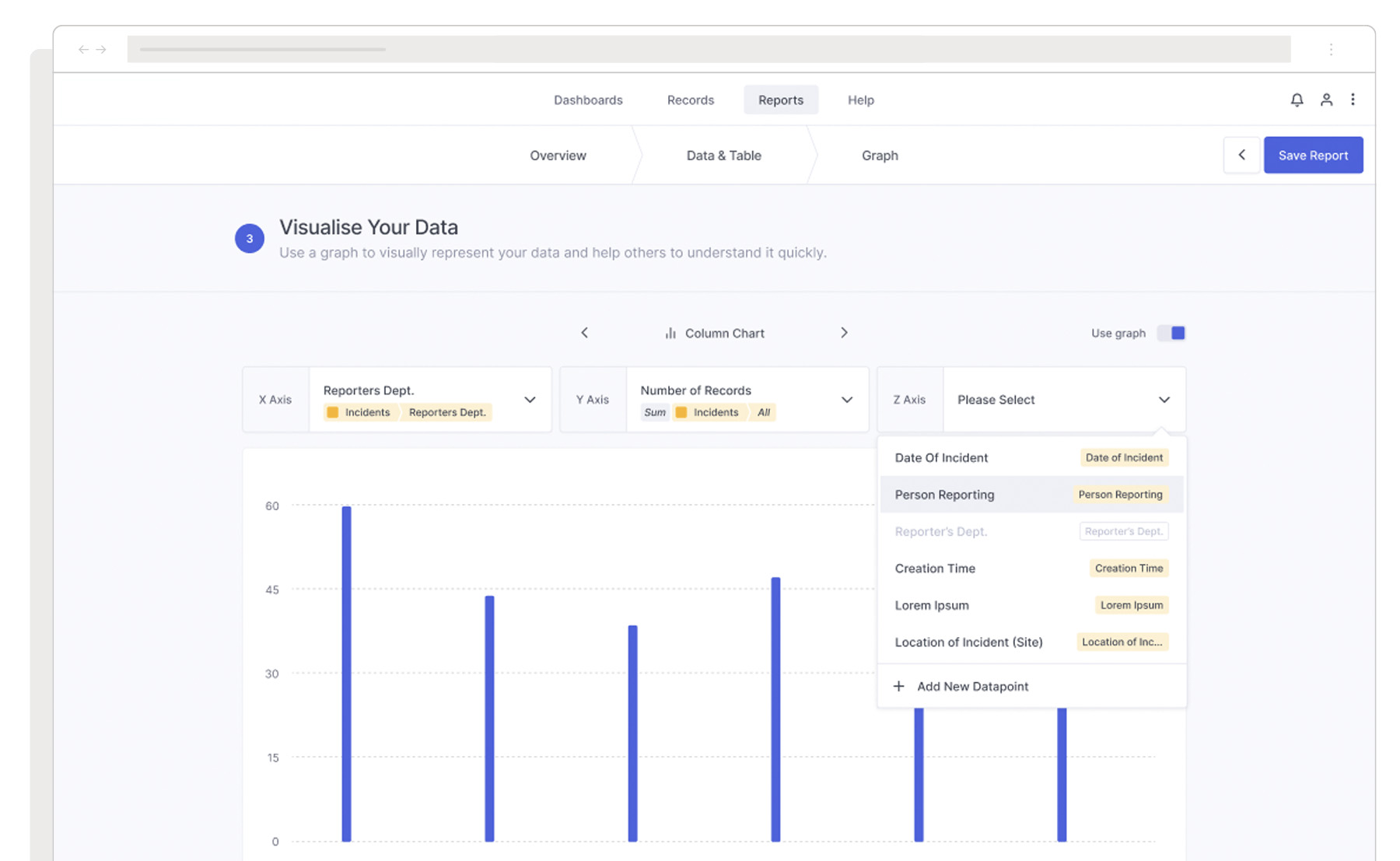
The new design provides compliance officers and administrators with an intuitive interface for building custom reports, integrating generative AI capabilities for quick data access. It allows easy saving and reuse of common report templates, enables granular filtering and segmentation of incident data, and enhances the visual presentation of reports for easier interpretation and sharing.
Handing over to IT
Together we redesigned the report generation functionality, introducing an intuitive query builder and the ability to save and reuse common report templates. The new design also includes granular filtering and segmentation options to allow for a deeper understanding of incident patterns and trends, as well as enhanced visual presentation of reports with clear, easy-to-interpret charts, graphs, and tables that can be easily shared with stakeholders.
During the concluding weeks of the project, we delivered consultancy services to both the Senior Leadership and IT teams advising on delivery and implementation. This included detailed recommendations on the most suitable frameworks to adopt, with a strong emphasis on ReactJS as the optimal choice for future scalability and user experience improvements across the front-end. This support aimed to facilitate a smoother, more efficient transition into the next phase of growth.