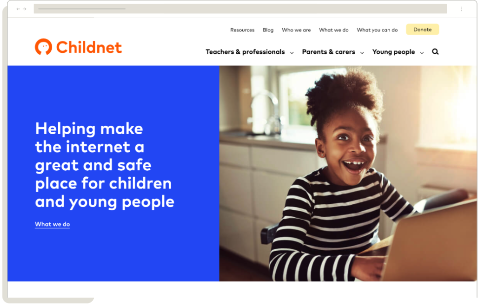
Childnet
How we helped Childnet revamped its web presence for young users
Childnet is a non-profit organisation dedicated to making the internet a safer place for children and young people. Operating in the digital safety and education sector, Childnet takes a unique approach by directly engaging with young people, parents, teachers, and policymakers. Their strategy involves creating educational resources, running awareness campaigns, and providing practical advice to help children navigate the digital world safely. Childnet stands out in their field by emphasising youth involvement and empowerment, ensuring that their initiatives are relevant and effective for their target audience.

Brief
Recognising the need to evaluate and improve their online presence, Childnet approached Browser London for assistance. They sought to conduct a comprehensive usability testing program for their website, with a specific focus on their young audience. The primary objectives were to understand how young people perceive the website, assess the discoverability and value of content designed for this audience, and identify areas for improvement. Childnet wanted to ensure that their digital platform effectively communicated their message and resources to the very demographic they aim to protect and educate.
Discovery
The discovery phase involved a diverse group of 10 participants aged 12-18 from the UK, currently in secondary school. The testing revealed mixed first impressions of the website.
While users appreciated the bright colours, friendly logo, and trustworthy brand, they struggled with information overload on the homepage and unclear content differentiation for young people. Navigation proved challenging, with users taking an average of 22.5 seconds to find the secondary school section, and many experiencing difficulty returning to main sections from content pages.
Findings
Content engagement showed promising results, with social media tips well-received by participants. However, users expressed a strong preference for video content over long-form text, indicating an opportunity for improvement in content delivery. The average ease of finding top tips was rated 7.7 out of 10, suggesting room for enhancement in content discoverability.
Recommendations
Based on these findings, several key recommendations were made. First, a redesign of the website’s structure was proposed, including the creation of a separate microsite or landing page for young people and the implementation of a splash page to divide audiences at the entry point.
To improve navigation, suggestions included redesigning the main site navigation, adding breadcrumbs, ‘next’ and ‘previous’ buttons, and ‘related content’ modules. Content strategy recommendations focused on incorporating more video content, creating a family of illustrations to better signpost content sections, and implementing hover states on topic blocks to provide quick definitions.
Outcomes
By providing a more focused and less overwhelming experience for core audiences, Childnet can create a more effective online resource that resonates with its young audience and better achieves its mission of promoting internet safety. Future redesigns should involve consulting with young people to validate key design and UX directions, ensuring the website continues to meet the evolving needs of its target audience.